
Freya 0.2
4/14/2024 - marc2332👋 hey
Hey! I am Marc, I just released the v0.2 of Freya 🦀, a native cross-platform GUI library for Rust, which just recently surpassed 1000 ⭐ on GitHub, thanks!
Many things have been added or changes since the latest 0.1 release back in August.
The new counter.rs example!
🧬 Dioxus 0.5
Dioxus, the UI library in which Freya is built on, has recently released a new version 0.5, adding a bunch of new features. If I had to describe their new release with one word, it would be Simplicity. It took some time to adjust to the new APIs but it was worth.
Here are the main changes of their release:
- Removal of
Scopeparameter in all Components - Removal of the
render!()macro - Simplification all the state management by using Signals
- Removal of lifetimes in Props,
Eventhandlers andElements
🧰 Components
Quite a few new components have been added to freya-components, existing have been improved as well.
Here are the new ones.
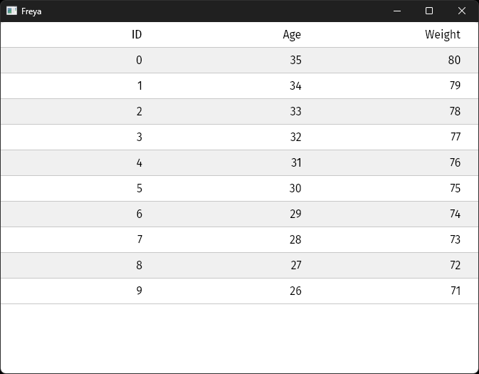
🪟 Table
We all know what a table is, and this is no different.
You compose a table by combining the different available components like Table, TableRow, TableCell, etc. This flexibility gives you complete control over the data, so you can do things like sorting and then just feed it.
More complex example.
Example:
// Data that might coming from anywhere, in this case it's just dummy random data for the sake of the example
let data = use_signal(|| {
    (0..10)
        .map(|i| {
            vec![
                format!("{i}"),
                format!("{}", 5 - i + 30),
                format!("{}", 10 - i + 70),
            ]
        })
        .collect::<Vec<Vec<String>>>()
});

let columns = use_signal(|| {
    vec![
        "ID".to_string(),
        "Age".to_string(),
        "Weight".to_string(),
    ]
});

rsx!(
    Table {
        columns: columns.len(),
        // Render the head of the Table
        TableHead {
            // With only 1 row
            TableRow {
                // And 1 cell for every column
                for (n, text) in columns.read().iter().enumerate() {
                    TableCell {
                        key: "{n}",
                        label {
                            "{text}"
                        }
                    }
                }
            }
        }
        // Just the main content of the Table, where all the rows go
        TableBody {
            // You could even use VirtualScrollView if you had to deal with large data sets
            ScrollView {
                for (i, items) in data.read().iter().enumerate() {
                    // 1 row for very data line
                    TableRow {
                        key: "{i}",
                        alternate_colors: i % 2 == 0,
                        for (n, item) in items.iter().enumerate() {
                            TableCell {
                                key: "{n}",
                                label {
                                    width: "100%",
                                    text_align: "right",
                                    "{item}"
                                }
                            }
                        }
                    }
                }
            }
        }
    }
)
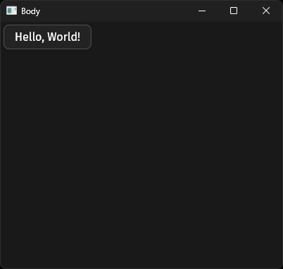
🧍♂️ Body
Body is a new simple container that comes with styled background matching the current theme and expands to the available area.
Not very innovating as you can see, but quite useful for pretty much all apps that want to use themes.
Example:
use_init_theme(DARK_THEME);

rsx!(
    Body {
        Button {
            label {
                "Hello, World!"
            }
        }
    }
)
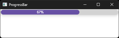
🔃 ProgressBar
A simple progress bar to display the current progress of something. You only need to feed it a f32.
More complex example.
Example:
let progress = 67.0; // Could be derived from another state for example

rsx!(
    ProgressBar {
        show_progress: true,
        progress
    }
)
💻 VirtualScrollView
VirtualScrollView, the component used to create virtualized scroll views has been simplified and improved.
- You don’t need to wrap the builder function inside a
Box<T>anymore - Reduced the builder function arguments from 4 to 2
- Optional partial caching of elements
Example:
let values = use_signal(|| ["Hello, World!"].repeat(300));

rsx!(VirtualScrollView {
    length: values.read().len(),
    item_size: 25.0,
    direction: "vertical",
    cache_elements: false, // Default is true.
    builder: move |index, _: &Option<()>| {
        let value = values.read()[index];
        let background = if index % 2 == 0 {
            "rgb(200, 200, 200)"
        } else {
            "white"
        };
        rsx! {
            rect {
                key: "{index}",
                background: "{background}",
                width: "100%",
                label {
                    height: "25",
                    "{index} {value}"
                }
            }
        }
    }
})
🍫 Snackbar
A new Snackbar component has been added to let you render whatever you want, e.g information, in a small animated box that will pop up from the bottom.
More complex example.
Demo on X (Twitter) 🎥.
Example:
let mut show = use_signal(|| false);

rsx!(
    Button {
        onclick: move |_| {
            show.toggle();
        },
        label { "Toggle" }
    }
    SnackBar {
        show,
        label {
            "Hello, World!"
        }
    }
)
📱 NativeRouter
NativeRouter is a opt-in component to be used in combination with dioxus-router, it provides navigation with the back and foward buttons of the mouse, like Web browsers.
All you have to do is wrap your components inside of a NativeRouter which should also be a descendant of a Router.
Example
#[derive(Routable, Clone, PartialEq)]
#[rustfmt::skip]
pub enum Route {
    #[layout(Layout)]
        #[route("/")]
        Home,
    #[end_layout]
    #[route("/..route")]
    PageNotFound { },
}

// Because this component is used as layout for all the routes
// Using the back and forward buttons will work in all of them.
#[component]
fn Layout() -> Element {
    rsx!(
        NativeRouter {
            Outlet::<Route> {  }
        }
    )
}
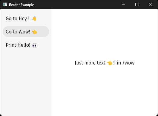
🧱 Sidebar
Sidebar is a new component to let you have have a menu in the left side and content in the right side, this is specially useful when used in combination with dioxus-router and NativeRouter.
Here there is an example.
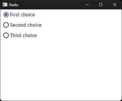
📻 Radio
Use the new Radio component to select a value from a list. It does not have any hidden inner state, you must handle the state logic yourself, which might need a little boilerplate at first but it simplifies things at scale.
Example (only one radio to simplify things):
let mut selected = use_signal(|| Choice::FirstChoice);

rsx!(
    Tile {
        onselect: move |_| selected.set(Choice::FirstChoice),
        leading: rsx!(
            Radio {
                selected: *selected.read() == Choice::FirstChoice,
            },
        ),
        label { "First choice" }
    }
)
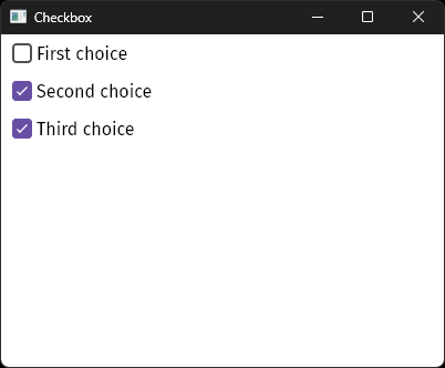
✅ Checkbox
Toggle different options from a list of values with Checkbox. Just like Radio, Checkbox doesn’t have any inner hidden state, you must write the state logic yourself.
Example (only one Checkbox to simplify things):
let mut selected = use_signal::<HashSet<Choice>>(HashSet::default);

rsx!(
    Tile {
        onselect: move |_| {
            if selected.read().contains(&Choice::FirstChoice) {
                selected.write().remove(&Choice::FirstChoice);
            } else {
                selected.write().insert(Choice::FirstChoice);
            }
        },
        leading: rsx!(
            Checkbox {
                selected: selected.read().contains(&Choice::FirstChoice),
            },
        ),
        label { "First choice" }
    }
)
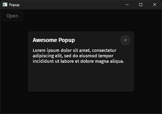
📰 Popup
Popup , also called Dialog or Floating Window in other frameworks / libraries is exactly what you think it is, a floating container that is in top of anything else (hence why it’s called popup, because it pops out!).
It comes with a close button on the top right corner and you can put anything you want inside of it.
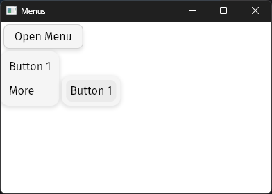
🖱️ Menu
With the new Menu component you can compose floating menus with the help of the MenuButton and SubMenu components.
More complex example.
Example:
let mut show_menu = use_signal(|| false);

rsx!(
    Button {
        onclick: move |_| show_menu.toggle(),
        label { "Open Menu" }
    },
    if *show_menu.read() {
        Menu {
            onclose: move |_| show_menu.set(false),
            MenuButton {
                label {
                    "Button 1"
                }
            }
            SubMenu {
                menu: rsx!(
                    MenuButton {
                        label {
                            "Button 1"
                        }
                    }
                ),
                label {
                    "More"
                }
            }
        }
    }
)
🗺️ ActivableRoute and use_activable_route
Sometimes you might want to know if a route is selected so you can show a different part of the UI, like a button with a different colour.
Previously, this used to require you to know what type of Route you were using in your app in all the components where you wanted to render them differently based on what route was selected.
ActivableRoute and use_activable_route fix this by passing a context to all their children, this way they don’t need to know if a certain route is enabled or not, they simply know whether some route is enabled. This is very useful for route-agnostic reusable components.
Link {
    to: Route::Home, // Direction route
    ActivableRoute {
        route: Route::Home, // Activation route
        SidebarItem {
            // `SidebarItem` will now appear "activated" when the route is `Route::Home`
            // `ActivableRoute` is letting it know whether `Route::Home` is enabled
            // or not, without the need to add router-specific logic in `SidebarItem`.
            label {
                "Go to Hey ! 👋"
            }
        },
    }
},
🪝 Hooks
All built-in hooks are now Copy thanks to the new Signals system in Dioxus, which means you won’t need to use to_owned![] as often as before.
♻️ use_asset_cacher
This new hooks provides a global store for assets to be stored and used across components in your app, it’s actually powering NetworkImage now.
It simply let’s you cache an asset in the form of bytes with a given duration. Once the duration has elapsed from the moment you used the last time, it will get removed from the cache.
🎥 use_animation
Previously, there used to be two hooks for animations use_animation and use_animation_transition, these two have now been merged under use_animation and refactored from the ground up, the api is now more flexible and robust than before.
For instance, let’s say you want to create an animation that will animate from a value from 25.0 to 75.0 in a duration of 200ms with an Expo function and an Out ease.
// Create animation
let animation = use_animation(|ctx| {
    ctx.with(
        AnimNum::new(25.0, 75.0)
            .time(200) // Alternative to `.duration(Duration::from_millis(200))`
            .function(Function::Expo)
            .ease(Ease::Out),
    )
});

// Retrieve current value
let value = animation.get().as_f32();

// UI
rsx!(
    Button {
        onclick: move |_| animation.start(), // Start the animation on click
        label {
            "Value {value}"
        }
    }
)
You could also have multiple animations, that start automatically and reverse when they are finished:
// Create animation
let animation = use_animation(|ctx| {
    ctx.auto_start(true); // Start the animation when this component is mounted
    ctx.on_finish(OnFinish::Reverse); // When the animation finishes, run it in reverse of the last run
    (
        ctx.with(AnimNum::new(0., 100.).time(200)), // Animate a value from 0 to 100 in 200ms
        ctx.with(AnimColor::new("rgb(245, 25, 30)", "blue").time(200)) // Animate a color transition in 200ms
    )
});

// Retrieve values
let (width, color) = animation.get();
let width = width.read().as_f32();
let background = color.read().as_string();

// UI
rsx!(
    rect {
        height: "100%",
        width: "{width}",
        background: "{background}"
    }
)
📃 use_form
use_form is a new and very simple hook with the single goal of simplifyind and avoiding having to add a lot of boilerplate.
This is still work in progress, more types of values will be added.
Example:
#[derive(Hash, PartialEq, Eq, Clone, Debug)]
enum FormEntry {
    Name,
    Description,
}

fn app() -> Element {
    let form = use_form(|data| {
        // This callback will be called once the submit button has been triggered.
        println!("Submitting: {data:?}");
    });

    rsx!(
        Input {
            // Register an input for the `Name` entry
            ..form.input(FormEntry::Name)
        },
        Input {
            // Register an input for the `Description` entry
            ..form.input(FormEntry::Description)
        },
        Button {
            // Register a submit button.
            children: rsx!(
                label {
                    "Submit"
                }
            ),
            ..form.submit(),
        }
    )
}
🏗️ Layout
In case you didn’t know Freya is powered by a framework-agnostic layout library I made for it, called Torin.
📐 Alignments
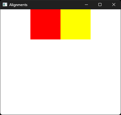
Previously, there was only a very basic way of aligning elements by using display: center and direction: both, this wasn’t easy to understand or to use. So, I have deprecated the display attribute and the both mode of the direction attribute.
Now, direction now only accepts vertical and horizontal and to configure the alignment of both axis you can use the main_align and cross_align attributes with both accepting the values of start | center | end, with start being the default.
main_align aligns the elements in the selected direction and cross_align in the opposite.
Example vertically:
rsx!(
    rect {
        height: "100%",
        width: "100%",
        direction: "vertical",
        main_align: "center", // All elements will be centered vertically because `direction` is vertical
        cross_align: "end", // All elements will be aligned horizontally in the end
        rect {
            width: "100",
            height: "100",
            background: "red",
        }
        rect {
            width: "100",
            height: "100",
            background: "yellow",
        }
    }
)
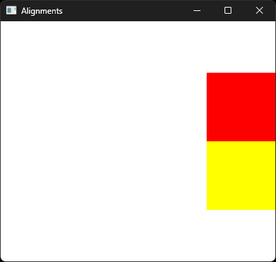
Example horizontally:
rsx!(
    rect {
        height: "100%",
        width: "100%",
        direction: "horizontal",
        main_align: "center", // All elements will be centered horizontally because `horizontal` is vertical
        cross_align: "start", // All elements will be aligned vertically in the center
        rect {
            width: "100",
            height: "100",
            background: "red",
        }
        rect {
            width: "100",
            height: "100",
            background: "yellow",
        }
    }
)
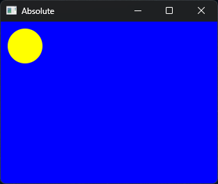
📌 Position absolute
Support for absolute positioning has been added, which means that you can make a certain element float relatively to it’s parent.
A caveat is that the positioned element must have a fixed size.
rsx!(
    rect {
        background: "blue",
        width: "100%",
        height: "100%",
    }
    rect {
        background: "yellow",
        position: "absolute",
        position_top: "10",
        position_left: "10",
        width: "50",
        height: "50",
        corner_radius: "100"
    }
)
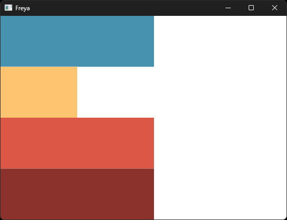
💪 content: fit and fill-min
The new content attribute and fill-min brings more flexibility by letting you expand the size of certain elements to the max of their biggest sibling.
Example:
rsx!(
    rect {
        content: "fit",
        height: "100%",
        rect {
            width: "fill-min", // Use the width of the biggest sibling element (300)
            height: "25%",
            background: "rgb(71, 147, 175)",
        }
        rect {
            width: "150", // Fixed size of 150
            height: "25%",
            background: "rgb(255, 196, 112)",
        }
        rect {
            width: "fill-min", // Use the width of the biggest sibling element (300)
            height: "25%",
            background: "rgb(221, 87, 70)",
        }
        rect {
            width: "300", // Fixed size of 300
            height: "25%",
            background: "rgb(139, 50, 44)",
        }
    }
)
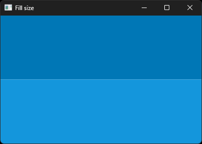
🥤 fill size
Size attributes like width and height now accept fill as attribute, this will make the element use the remaining available area.
rsx!(
    rect {
        height: "50%",
        width: "100%",
        background: "rgb(0, 119, 182)",
    }
    rect {
        height: "fill",
        width: "100%",
        background: "rgb(20, 150, 220)",
    }
)
⚡ Performance improvements
The measuring of layout, specially when there are a few nested special alignments will be faster than before because it now requires less phases.
Incremental layout is now also more precise than before, by remeasuring only those nodes that have been truly affected by the UI changes.
💅 Styling
🎨 Hex colors
Freya now has support for hex colors thanks to Taym.
It only supported colors by name or using rgb() or hsl() functions until now.
Example with hex:
rsx!(
    label {
        color: "#E93323",
        "Hello, World!"
    }
)
🖌️ Theming
The theming system for components has been remade to be more flexible and scalable. Now you can pass override specific parts or the whole theme of a specific component with a simple prop.
Thanks to Leonard (@tigerros) !
Example:
rsx!(
    Button {
        theme: theme_with!(ButtonTheme {
            padding: "0".into(), // Passing custom padding before was possible
            hover_background: "black".into() // But passing custom hover wasn't possible
        }),
        label {
            "Hello, World!"
        }
    }
)
📚 Docs
The docs have been reorganized and most API references previously located in the Book have now been integrated into the source code itself allowing these to be versioned.
The book is now also smaller and will serve as a place for guides and similar.
Some new examples have been added, some removed and others updated!
📞 Events
🫧 Event Bubbling
Due to a bug in Dioxus (now fixed), Freya was not capable of having proper Event Bubbling.
This was very limiting for certain components, specially those that float over others.
Fortunately this is no longer the case and Freya now properly supports event bubbling, which means that you can let the events propagate from bottom to top elements and stop them when you wish to.
Example:
rsx!(
    rect {
        onclick: |_| {
            println!("Clicked B!");
        },
        rect {
            onclick: |e| {
                // Stop the bubbling of the event if you want to
                e.stop_propagation();
                println!("Clicked A!");
            },
            background: "blue",
            label {
                "hey"
            }
        }
    }
)
🤙 New Events
A few new events have been added and changed.
onclick now only triggers when clicking with the lef button of the mouse, and there is now onmiddleclick and onrightclick for the other two.
New events for file drag and drop have been added, onfiledrop, onglobalfileover and onglobalfileovercancelled.
🚚 Platform integrations
You can now launch apps with a custom window icon, max width and max height. But if you want to go further you can access the window builder thanks to a new method with_window_builder.
The hook use_platform now also let’s you read the size of the Window.
🧩 Plugins API
Freya now comes with a Plugin API to bring extra features to apps, it consists of a simple FreyaPlugin trait and a with_plugin register method.
Note: The API could change in the future, it is still kind of an experiment to see where things could go.
struct BlogPlugin;

impl FreyaPlugin for BlogPlugin {
    fn on_event(&mut self, event: &PluginEvent) {
        // You can react on certain events like after rendering
        if let PluginEvent::AfterRender { .. } = event {
            // Whenever you hover the button it will rerender and thus this log will be printed
            println!("The app just got rendered to the canvas.");
        }
    }
}

fn main() {
    launch_cfg(
        app,
        LaunchConfig::<()>::builder()
            .with_plugin(BlogPlugin) // Here you register the instance of the plugin
            .build(),
    )
}

fn app() -> Element {
    rsx!(
        Button {
            label { "Hover me!" }
        }
    )
}
⏱️ Performance Plugin
Freya now comes with a Performance plugin you can use to show certain metrics your app:
| Metric | Description |
|---|---|
FPS | Only significant for apps that rerender very frequently |
Rendering | Time taken to render. |
Layout | Time taken to measure the layout. |
DOM Updates | Time taken to synchronize the Native DOM with changes from the VirtualDOM. |
DOM Nodes | Number of nodes in the Native DOM. |
Layout Nodes | Number of nodes in the Layout tree, excluding text nodes. |
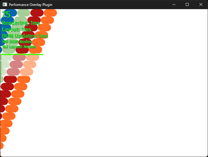
Here is an old demo as well.
👨🦯 Headless Testing runner
Freya comes with a headless testing runner to let you test certain components in a non-graphic (headless) environment.
A few improvements have been done, such as a slighly smarter polling of the VirtualDOM as well added some new utils.
Major new features:
is_visible: Assert whether a specific Node is visible in the screen or not. This is very useful to testScrollViewsand similar components.get_by_textGet a specific Node searching by its containing text.
⌨️ Text Editing
- Fixed small bugs and made the experience just better
- Added support for
Copy,Cut,Pastethanks to the newuse_clipboardhook added to Dioxus SDK. - Added support for
RedoandUndoas well for theuse_editablehook.
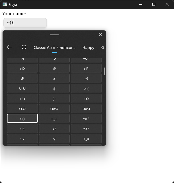
🦾 Accessibility
Partial IME support has been added, but there is still work to do regarding text editing.
Some of the built-in components have been made more accessibile as well, but not all of them. Again, there is work to do.
For instance, you can now use the Windows Emoji panel when using the Input component, although emojis are not fully supported for text editing:
🔨 Core
🔭 Viewports and Layer
Freya used to organize all the Nodes by layers and calculate their viewports in every single frame, while this was fast enough most of the time, an extra performance improvement is always welcome.
Now, these are incrementally created and removed in parallel, thus being so much faster.
📄 Text shaping caching
Shaping of text is now cached between rerenders unless they need to be redone, obviously.
🍴 Forked native-core and native-core-macro
native-core and native-core-macro crates were use by the native renderers of Dioxus, and also Freya. But they have now been deprecated, so I forked them and took the opportunity to make some changes such as removing unused features by Freya or adapted certain APIs to fit better into Freya:
- Remove event listeners from TextNodes
- Typed Enums for tag, attributes and listeners in DOM Nodes instead of
Strings - Remove Namespaces
- Remove Custom Elements
- Not store TextNodes states in the ECS
- Simplified DOM Traversal
- Simplified and removed other things not used by Freya
🏠 Codebase
A bunch of new tests have been added, specially for Components, Hooks and for layout, this has resulted in jumping from a 52% code coverage to 73%. I want to increase this number by adding more tests to cover more features. But, it’s getting harder as there is a big chunk of code that is just the winit desktop renderer, which is definitely not very testing-friendly.
Dependencies have also been cut down a bit, for instance, Windows builds have went from 490 to 426, not a big difference but still appreciated nonetheless.
🌐 Revamped Website
The website has been revamped, a few people have told me that the landing didn’t work because when you click on the clickable element it doesn’t update the counter, but it’s not supposed to work at all, it was just a UI demo of how the app would look.
Anyway, I changed it and it now has video instead. The website also now ships a total of 0kb of JavaScript to client browsers.
And a blog has been integrated as well as you can tell ✨.
🫂 Community
While I work in Freya most of the time, I also maintain other crates, some freya-compatible, such as dioxus-radio, Dioxus SDK or the others from dioxus-community. These two and others have been updated to Dioxus 0.5, which means they can be used in Freya 0.2.
I have plans on adding support for Freya in dioxus-free-icons, so freya users gain access ot thousands of icons. Help is appreciated, feel free to contribute!
🛤️ Roadmap
More built-in components
I think that GUI frameworks should have decent support for the most popular and basic components, so the devs can get started quickly.
There are still many components that I want to add to Freya, like date pickers or color pickers for instance.
More accessible components
Some components have some level of accessibility support but others don’t, and the accessibility integration in general could be polished.
Better testing tools
Some people think testing UI is useless, and they are probably right, except for libraries or critical apps, in my opinion.
I want to be sure all my components are working when I make a change in the core of my project. Testing a button might sound stupid but when you have a virtual scroll view, things can get complicated really quick with simple changes, better test it just to be sure.
Improved Docs
While I try to doc everything I can the best way possible, there is so many things and I am not perfect. I’ll try to improve this area, help is appreciated too!
Vulkan Support
Freya currently runs on OpenGL, I want to experiement with running it with vulkan (and perhaps leave OpenGL as a runtime fallback?). Skia supports doing so, but I lack the knowledge for this. So, if you know about this stuff feel free to contribute (I’d love you to!), more info.
🙋♂️Special thanks!
Thanks for the Dioxus core team for all the hard work on improving the framework, also to the friendly and helpful Dioxus Community 😀 🧬 and the few ocasional contributors of Freya 🟣.
Also thanks to my 🐙 Github Sponsors for sponsoring me!
I’d appreciate that if you are interested in helping financially you consider sponsoring me on Github as I do this from the heart, in my free time.
Thanks for reading ! 👋