
Freya 0.3
5/25/2025 - marc2332hey
Hey again, this is the announcement of Freya v0.3, the latest release of my Rust 🦀 GUI Framework.
It has been around 1 year since I last made the last release (v0.2) and blog post and a quite few things have changed so this blog post will be an overview of mostly user-facing changes that I considered worth mentioning, for a more complete changelog list you can check the v0.3 Release in GitHub.
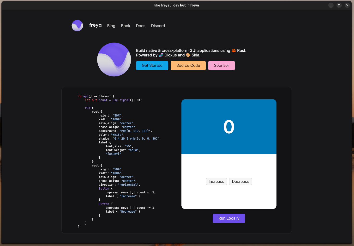
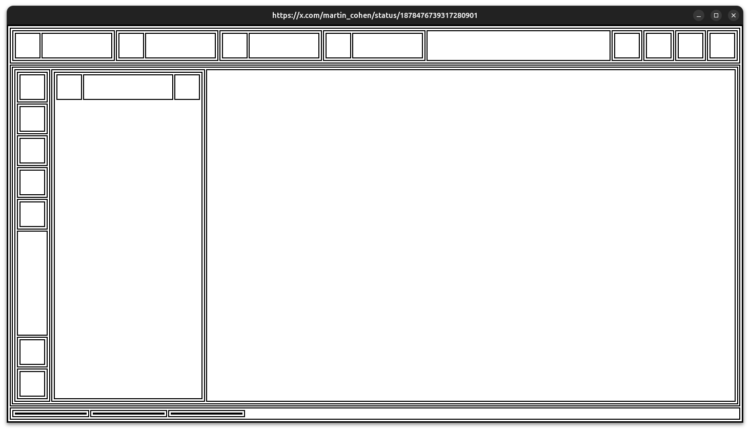
This is a freya example that replicates its own website https://freyaui.dev/! (it isn’t an actual html/css/js app, it is a desktop app).
Source code in GitHub
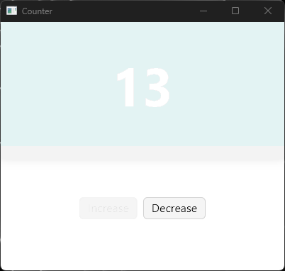
Incremental Rendering
Previously any change in the UI caused a full rerender. Now, rendering happens incrementally so only those all parts in the UI that change are rerendered, leaving the the rest intact, this translates to better performance even when consdering the cost of the calculations from incremental rendering.
For the purpose of internal debugging, I added a feature called fade-cached-incremental-areas to make the incremental rendering more evident. The parts of the UI that are left intact slowly fade out as new incremental renders are applied (this was inspired by an Iced video I saw some time ago).
This is the counter example after me having moved my cursor a few times over the Decrease button.
Layout
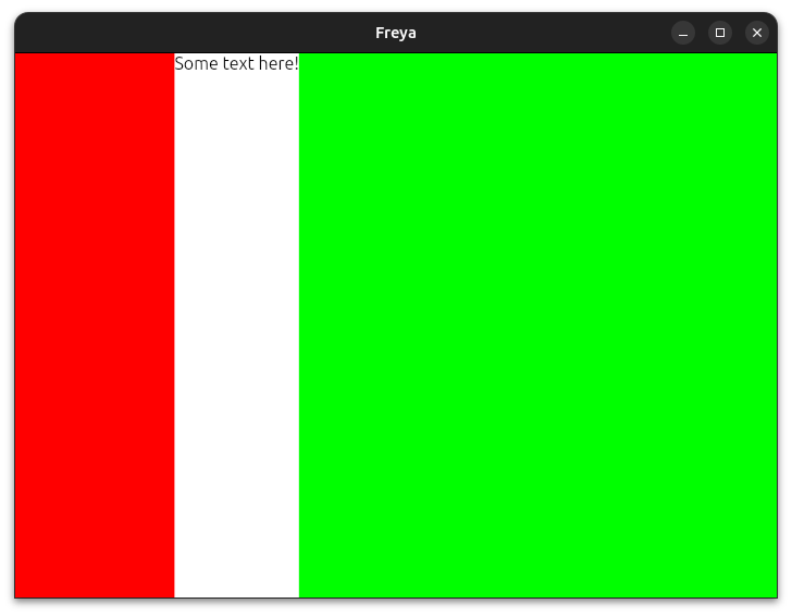
Flex
Freya now supports Flex layouting by using a combo of attributes, here is an example:
fn app() -> Element {
    rsx!(
        rect {
            content: "flex", // Marks this element as a Flex container
            direction: "horizontal",
            rect {
                width: "flex(1)", // Use 1/4 (25%) of the parent space after excluding the text from below
                height: "fill",
                background: "red"
            }
            label {
                "Some text here!"
            }
            rect {
                width: "flex(3)", // Use 3/4 (75%) of the parent space after excluding the text from above
                height: "fill",
                background: "green"
            }
        }
    )
}
Source code of another example in GitHub.
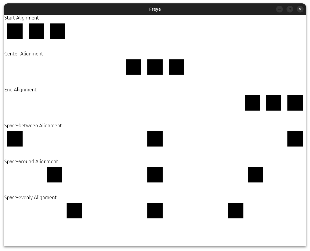
Alignments
The new space-between / space-around / space-evenly attributes mimic the behavior of CSS:
space-between: Distributed among the available spacespace-around: Distributed among the available space with small margins in the sidesspace-evenly: Distributed among the available space with the same size of margins in the sides and in between the elements.
You can find more info in main_align attribute.
Example:
Note that each square has a margin of 10 pixels to make it more clear.
Source code of the example in GitHub.
Spacing attribute
The new spacing attribute is a small but nice addition, it allows you to specify the space between elements from their parent element:
fn app() -> Element {
    rsx!(
        rect {
            spacing: "10",
            for i in 0..6 {
                rect {
                    key: "{i}",
                    background: "rgb(25, 35, 45)",
                    width: "100%",
                    height: "50"
                }
            }
        }
    )
}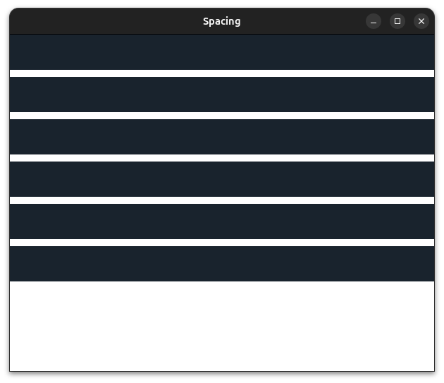
Source code of the example in GitHub.
Global Position
Elements can now be globally positioned, meaning that they will be positioned starting at X:0 and Y:0 of the window and they will not affect any other sibling element.
So it’s like absolute but where the element is relative to the window and not the parent element.
Example:
fn app() -> Element {
    rsx!(
        rect {
            padding: "10",
            rect { // Notice how this uses the padding from the parent element
                height: "20%",
                width: "20%",
                background: "black",
                position: "absolute",
                position_top: "10",
                position_left: "10",
            }
            rect { // But this one doesn't
                height: "20%",
                width: "20%",
                background: "red",
                position: "global",
                position_top: "10",
                position_right: "10",
            }
        }
    )
}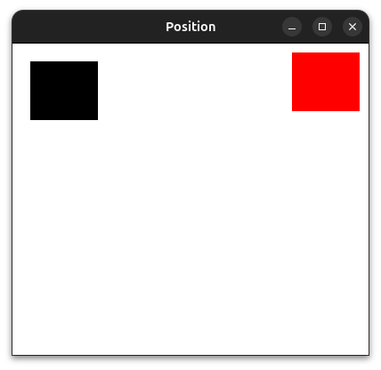
Source code of the example in GitHub.
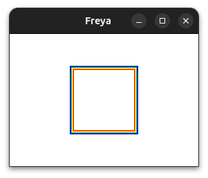
Styling
rect elements can now have multiple borders using the border attribute.
Example:
fn app() -> Element {
    rsx!(
        rect {
            main_align: "center",
            cross_align: "center",
            width: "fill",
            height: "fill",
            rect {
                width: "100",
                height: "100",
                border: "6 inner red, 5 inner orange, 4 inner yellow, 3 inner green, 2 inner blue, 1 inner purple",
            }
        }
    )
}
Another Example:
fn app() -> Element {
    rsx!(
        rect {
            main_align: "center",
            cross_align: "center",
            width: "fill",
            height: "fill",
            rect {
                width: "100",
                height: "100",
                border: "15 inner linear-gradient(0deg,rgb(98, 67, 223) 0%,rgb(192, 74, 231) 33%,rgb(255, 130, 238) 66%, white 100%), 4 center radial-gradient(red 0%, blue 80%)",
            }
        }
    )
}
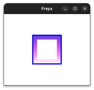
Source code of a more complex example in GitHub.
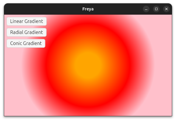
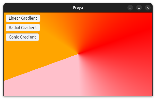
Radial and conic gradients
Support for radial and conic gradients have been added.
Example of their syntax:
fn app() -> Element {
    let mut gradient = use_signal(|| GradientExample::Linear);

    let background = match *gradient.read() {
        GradientExample::Linear => {
            "linear-gradient(250deg, orange 15%, rgb(255, 0, 0) 50%, rgb(255, 192, 203) 80%)"
        }
        GradientExample::Radial => {
            "radial-gradient(orange 15%, rgb(255, 0, 0) 50%, rgb(255, 192, 203) 80%)"
        }
        GradientExample::Conic => {
            "conic-gradient(250deg, orange 15%, rgb(255, 0, 0) 50%, rgb(255, 192, 203) 80%)"
        }
    };

    rsx!(
        rect {
            background,
            ...
        }
    )
}
Radial:
Conic:
Source code of a more complete example in GitHub.
Images
import_image
With the import_image macro you can easily turn image files into components.
import_image!(RustLogo, "./rust_logo.png", {
    width: "auto",
    height: "auto",
    sampling: "trilinear",
    aspect_ratio: "min",
});

fn app() -> Element {
    rsx!(RustLogo {})
}
aspect_ratio and cover
Images before needed explicit sizing by the developer, this is now optional as images are by defauly sized according to their encoded size. You can still tweak this behavior with the new aspect_ratio attribute.
In addition to that, a new cover attribute has been added to center the image according to its aspect ratio and size.
Source code of the example in GitHub.
Cache Rendering
Images can now optionally cache their decoding at render-level by specifying a cache_key, this tells Freya to cache the image bytes and to not decode it again on the next frame.
static RUST_LOGO: &[u8] = include_bytes!("./rust_logo.png");

fn app() -> Element {
    rsx!(
        image {
            image_data: static_bytes(RUST_LOGO),
            width: "fill",
            height: "fill",
            aspect_ratio: "min",
            cache_key: "rust-logo",
        }
    )
}
For example, this is used by NetworkImage with the url as a cache key.
Source code of an example in GitHub.
SVG
import_svg
With the import_svg macro you can easily turn .svg files into components.
import_svg!(Ferris, "./ferris.svg", {
    width: "70%",
    height: "50%"
});

fn app() -> Element {
    rsx!(Ferris {})
}
Source code of an example in GitHub.
fill: "current_color"
SVGs can now use fill: "current_color" to use the inherited/used color as fill.
static SETTINGS: &[u8] = include_bytes!("./settings.svg");

fn app() -> Element {
    rsx!(
         svg {
            color: "red",
            fill: "current_color",
            width: "100%",
            height: "50%",
            svg_data,
        }
    )
}
Source code of an example in GitHub.
Misc
Scale Factor
Freya apps will now always be in sync with the OS configured scale factor. No need to close the app and reopen, it will update in live.
Virtualization
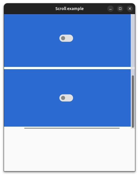
The VirtualScrollview component now does pre-rendering of the closest items at both the start and the end, making the scroll way smoother.
Text Editing
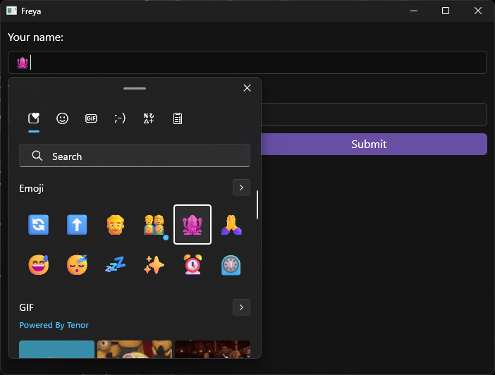
You can now use emojis and other special characters while editing text.
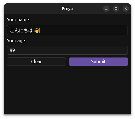
Other improvements like selecting with Control + Shift + Arrows have been added as well.
Theming
Themes are now composed of color palletes and component themes rather than just component themes, this makes it easier to reuse colors across component themes.
This is how the Dark theme is defined now:
pub const DARK_THEME: Theme = Theme {
    name: "dark",
    colors: ColorsSheet {
        primary: cow_borrowed!("rgb(103, 80, 164)"),
        focused_primary_border: cow_borrowed!("rgb(223, 180, 255)"),
        secondary: cow_borrowed!("rgb(202, 193, 227)"),
        tertiary: cow_borrowed!("rgb(79, 61, 130)"),
        surface: cow_borrowed!("rgb(60, 60, 60)"),
        secondary_surface: cow_borrowed!("rgb(45, 45, 45)"),
        neutral_surface: cow_borrowed!("rgb(25, 25, 25)"),
        focused_surface: cow_borrowed!("rgb(15, 15, 15)"),
        opposite_surface: cow_borrowed!("rgb(125, 125, 125)"),
        secondary_opposite_surface: cow_borrowed!("rgb(150, 150, 150)"),
        tertiary_opposite_surface: cow_borrowed!("rgb(170, 170, 170)"),
        background: cow_borrowed!("rgb(20, 20, 20)"),
        focused_border: cow_borrowed!("rgb(110, 110, 110)"),
        solid: cow_borrowed!("rgb(240, 240, 240)"),
        color: cow_borrowed!("rgb(250, 250, 250)"),
        primary_color: cow_borrowed!("white"),
        placeholder_color: cow_borrowed!("rgb(210, 210, 210)"),
        highlight_color: cow_borrowed!("rgb(96, 145, 224)"),
    },
    ..BASE_THEME
};
Styling of built-in components
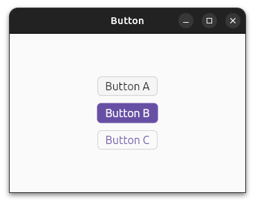
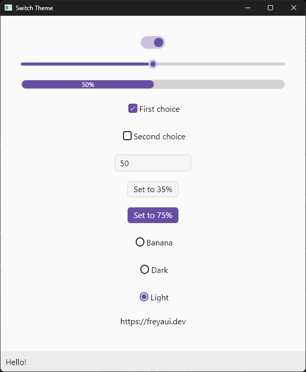
The style of the built-in components has been refreshed with a more modern look.
The button component now has 3 variants: Button, FilledButton, and OutlineButton.
The Scrollbar design has been refreshed, it now floats over the content with a small width unless you hover near it, then it gets bigger and gets a semi-transparent background.
Here there is a collection of some of the components, with a refreshed style:
New Docs
I have tried my best to make some decent docs, from introduction and getting started to API references.
There is still work to do but in my opinion it is a nice improvement over the previous releases.
You can find the different learning chapters in the docs.rs page.
If you happen to see something missing or not well explained please open an issue or even feel free to send a Pull Request.
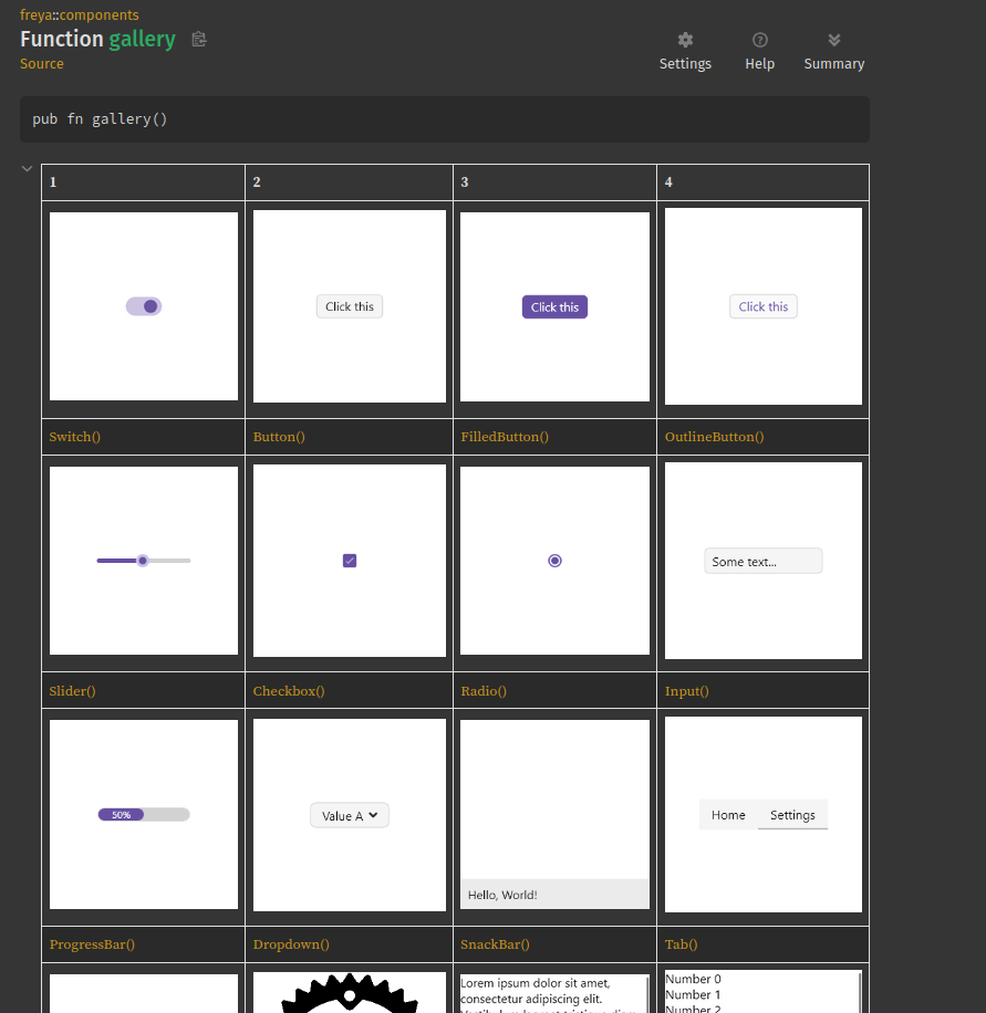
Also, the most important built-in components offer previews embedded in docs.rs so you can see how a component looks like before even using it. More will be added in the future.
Here is a docs-only gallery section with previews of them, you can also see the individual previews in their respective docs.
Dioxus 0.6
Freya now uses Dioxus 0.6, some memory-related issues has been fixed.
New components
AnimatedPosition
The AnimatedPosition component animates its inner content position over a set duration. Any layout change that could make its content move will then be animated. For this it needs to know the width and height in advance.
fn app() -> Element {
    rsx!(
        AnimatedPosition {
            width: "110",
            height: "60",
            function: Function::Quad,
            duration: Duration::from_millis(250),
            rect {
                background: "red",
                width: "60",
                height: "110"
            }
        }
    )
}
Here for example, clicking on “Toggle” changes the direction of the cards container, thus changing the cards position:
Source code of the example in GitHub.
Here is another example of cards that can be dragged and dropped:
Source code of the example in GitHub.
GlobalAnimatedPosition
GlobalAnimatedPosition is very similar to AnimatedPosition but it works with any content from anywhere and anytime. It requires an extra id value that should be guaranted not to change for the given element.
Here is an example of a grid, where each element is identified by a number. It doesnt matter that the elements get shuffled because each one is identified, therefore we can know where it comes from and where it goes and thus animate the transition.
The implementation could be improved to make the animation more fluid though.
This is how the root component looks like:
fn app() -> Element {
    let mut grid = use_signal(|| Grid::new(5));
    rsx!(
        rect {
            spacing: "12",
            main_align: "center",
            cross_align: "center",
            width: "fill",
            height: "fill",
            // This context provider is what stores the positions
            // The generic type is the ID type used for the cells
            GlobalAnimatedPositionProvider::<usize> {
                Button {
                    onpress: move |_| grid.write().suffle(),
                    label {
                        "Shuffle"
                    }
                }
                rect {
                    spacing: "6",
                    for row in grid.read().cells.chunks(5) {
                        rect {
                            direction: "horizontal",
                            spacing: "6",
                            for cell in row {
                                GlobalAnimatedPosition::<usize> {
                                    key: "{cell.id:?}",
                                    width: "100",
                                    height: "100",
                                    function: Function::Expo,
                                    duration: Duration::from_millis(600),
                                    id: cell.id,
                                    rect {
                                        width: "100",
                                        height: "100",
                                        background: "rgb({cell.id * 6}, {cell.id * 8}, { cell.id * 2 })",
                                        corner_radius: "32",
                                        color: "white",
                                        main_align: "center",
                                        cross_align: "center",
                                        label {
                                            "{cell.id:?}"
                                        }
                                    }
                                }
                            }
                        }
                    }
                }
            }
        }
    )
}
Complete source code of the example in GitHub.
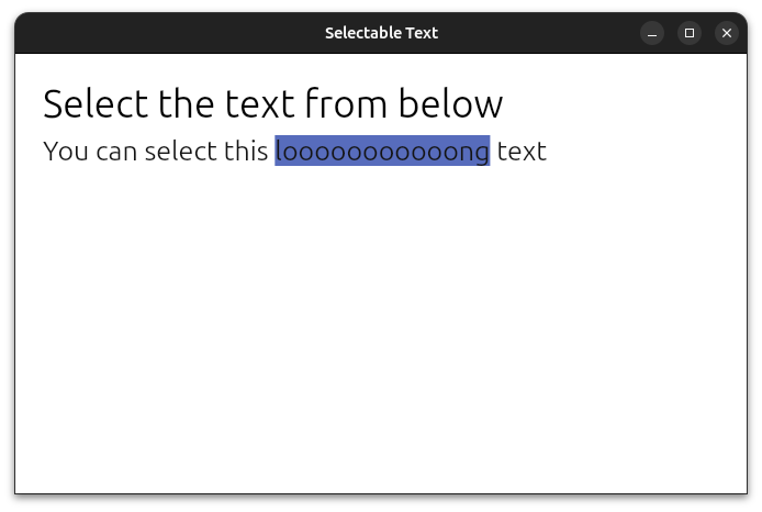
SelectableText
SelectableText allows to render a text that can be selected but not written, useful to allow copying for example.
Simple example:
fn app() -> Element {
    rsx!(
        SelectableText {
            value: "You can select this looooooooooong text"
        }
    )
}
Source code of the example in GitHub.
OverflowedContent
OverflowedContent Allows to render a long text in a tiny space by animating it.
Simple example:
fn app() -> Element {
    rsx!(
        Button {
            OverflowedContent {
                width: "100",
                rect {
                    direction: "horizontal",
                    cross_align: "center",
                    label {
                        "Freya is a cross-platform GUI library for Rust"
                    }
                }
            }
        }
    )
}
Source code of the example in GitHub.
ResizableContainer
ResizableContainer in combination with ResizablePanel and ResizableHandle makes it possible to have panels whose size can be resized by dragging thin bars (also called handles).
fn app() -> Element {
    rsx!(
        ResizableContainer { // This is where ours panels and handles will be defined, default direction is vertical
            ResizablePanel { // A resizable panel with a minimum size of 50
                initial_size: 50., // Custom initial size, default is 10
                label {
                    "Hello"
                }
            }
            ResizableHandle { } // A thin bar to resize
            ResizablePanel {
                initial_size: 50.,
                ResizableContainer { // And inside this panel we have yet another container, but this time it is horizontal
                    direction: "horizontal",
                    ResizablePanel {
                        initial_size: 35.,
                        label {
                            "World"
                        }
                    }
                    ResizableHandle { }
                    ResizablePanel {
                        initial_size: 20.,
                        min_size: 20., // Custom minimum size, default is 4
                        label {
                            "!"
                        }
                    }
                }
            }
        }
    )
}
Source code of the example in GitHub.
Tooltip
Tooltip and TooltipContainer can be used to show some text when hovering over the children of the component:
fn app() -> Element {
    rsx!(
        TooltipContainer {
            tooltip: rsx!(
                Tooltip {
                    text: "You can see me now!"
                }
            ),
            Button {
                label { "Hover me" }
            }
        }
    )
}
Source code of the example in GitHub.
AnimatedRouter
AnimatedRouter simplifies animating transitions between pages of a router.
Source code of the example in GitHub.
Animations API
The use_animation hook now offers fully typed animations, making it easier to use it. Before, the animated values were type-erased and so their capabilities were limited.
fn app() -> Element {
    // UseAnimation<AnimNum>
    let animation = use_animation(|conf| {
        conf.auto_start(true);
        AnimNum::new(0., 360.)
        .time(500)
        .ease(Ease::InOut)
        .function(Function::Expo)
    });
    // ReadOnly<AnimNum>, you can pass it to other components if you need
    let sequential = animation.get();

    // &AnimNum
    let anim_num = &*sequential.read();

    // f32
    let rotation: f32 = anim_num.into();

    rsx!(
        rect {
            width: "100",
            height: "100",
            rotate: "{rotation}deg",
            background: "rgb(0, 119, 182)"
        }
    )
}
An example of this is the new AnimSequential, an animated value that can animate N amount of values:
fn app() -> Element {
    let animations = use_animation(|conf| {
        conf.auto_start(true);
        AnimSequential::new([
            AnimNum::new(0., 360.)
                .time(500)
                .ease(Ease::InOut)
                .function(Function::Expo),
            AnimNum::new(0., 180.)
                .time(2000)
                .ease(Ease::Out)
                .function(Function::Elastic),
        ])
    });

    let sequential = animations.get();

    let rotate_a = sequential.read()[0].read();
    let rotate_b = sequential.read()[1].read();

    rsx!(
        rect {
            width: "100",
            height: "100",
            rotate: "{rotate_a}deg",
            background: "rgb(0, 119, 182)"
        },
        rect {
            width: "100",
            height: "100",
            rotate: "{rotate_b}deg",
            background: "rgb(0, 119, 182)"
        }
    )
}
Source code of the example in GitHub.
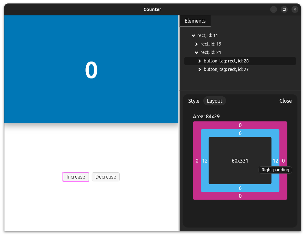
Devtools
The devtools got some quality of life improvements:
- Support for keyboard navigation in the nodes tree
- Persisting the style / layout tab when changing between nodes
- Rendering elements roles before their tags if available
- Slightly better layout preview
Accessibility
Keyboard navigation
Navigating with the keyboard (Tab and Tab + Shift) should now work in more components and work better in general.
Out of the box accessibility
Previously, only elements provided with an a11y_id attribute were accessible.
But now, all elements are created with an internal Accessibility ID out of the box (you can still pass your own using a11y_id), but for them to be actually useful in terms of accessibility you will need to use the a11y attributes.
This means that a11y_id has changed from being an opt-in attribute to now only being required if you want to have more control of the accessibility.
Its like holding a reference to the element. It can be used with use_focus to e.g dinamically focus the element at any given moment or to check if it is being selected with the keyboard.
New Attributes
A massive amount of accessibility attributes have been added to Freya, they all start with a a11y_ prefix to make them easier to spot and use.
Some of these include (existing ones were renamed too):
a11y_ida11y_rolea11y_auto_focusa11y_expandeda11y_hiddena11y_required
And a lot more.
IME
IME support has also been improved, and should work better than before.
Canvas Snapshots
When using the headless testing runner (freya-testing)[https://docs.rs/freya-testing/0.3.0/freya_testing/] to test freya components, you will be able to make snapshots of the UI canvas and saving them to the disk.
This can be very useful for when you want to debug something visually in a test.
As a matter of fact, I reused this same API to create the new embedded previews in docs.rs. See New Docs.
Example:
fn app() -> Element {
    let mut count = use_signal(|| 0);

    rsx!(
        rect {
            onclick: move |_| count += 1,
            label {
                font_size: "100",
                font_weight: "bold",
                "{count}"
            }
        }
    )
}

#[tokio::main]
async fn main() {
    let mut utils = launch_test(app);

    // Initial render
    utils.wait_for_update().await;
    utils.save_snapshot("./snapshot_before.png");

    // Emit click event
    utils.click_cursor((100., 100.)).await;

    // Render after click
    utils.save_snapshot("./snapshot_after.png");
}
Before:
After:
Source code of a more complex example in GitHub.
i18n
Not exactly linked to Freya but the way to go for i18n in Freya apps is now using dioxus-i18n.
Its as easy to use as simply calling the t!() macro in the UI when you need to translate some text, or using i18n() and set_language to make a language change.
Example:
#[allow(non_snake_case)]
fn Body() -> Element {
let mut i18n = i18n();
rsx!(
rect {
Button {
onpress: move |_| i18n.set_language(langid!("en-US")),
label { "English" }
}
Button {
onpress: move |_| i18n.set_language(langid!("es-ES")),
label { "Spanish" }
}
label { {t!("hello", name: "Dioxus")} }
}
)
}
fn app() -> Element {
use_init_i18n(|| {
I18nConfig::new(langid!("en-US"))
.with_locale(Locale::new_static(
langid!("en-US"),
include_str!("./en-US.ftl"),
))
.with_locale(Locale::new_static(
langid!("es-ES"),
include_str!("./es-ES.ftl"),
))
});
rsx!(Body {})
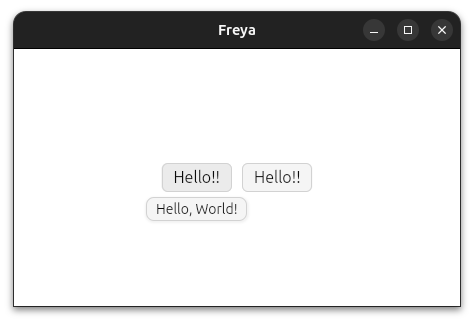
}# en-US.ftl
hello_world = Hello, World!
hello = Hello, {$name}!New Examples
Here is a list of just a few new cool examples I added since the last release.
todo:
Thanks!
I want to thank to the people who has helped and contributed to the project (specially to Aiving, Robertas and Tropix126) and also to my GitHub Sponsors (gqf2008, piny4man and Lino Le Van)!
If you want to support the project financially you can do so through my GitHub Sponsors.
From now on
I think I will probably stop making these blog posts as they take me too much time to write, I want to move to a faster release schedule so I will instead focus on simply make better changelogs in the GitHub releases. If something is worth of a blog post I will do it tho!
Thanks for reading ! 👋