

Freya 0.4
7/16/2026 - marc2332hey
👋 Hey again, this is the announcement of Freya v0.4, the latest release of my Rust 🦀 GUI library.
It has been around a year since v0.3 and this is by far the biggest and most stable release yet. Freya 0.4 comes with a big rewrite, the most notable change is that Freya no longer depends on Dioxus. Instead, it now has its own reactive and component model built from scratch.
For the full changelog you can check the v0.4 Release on GitHub.
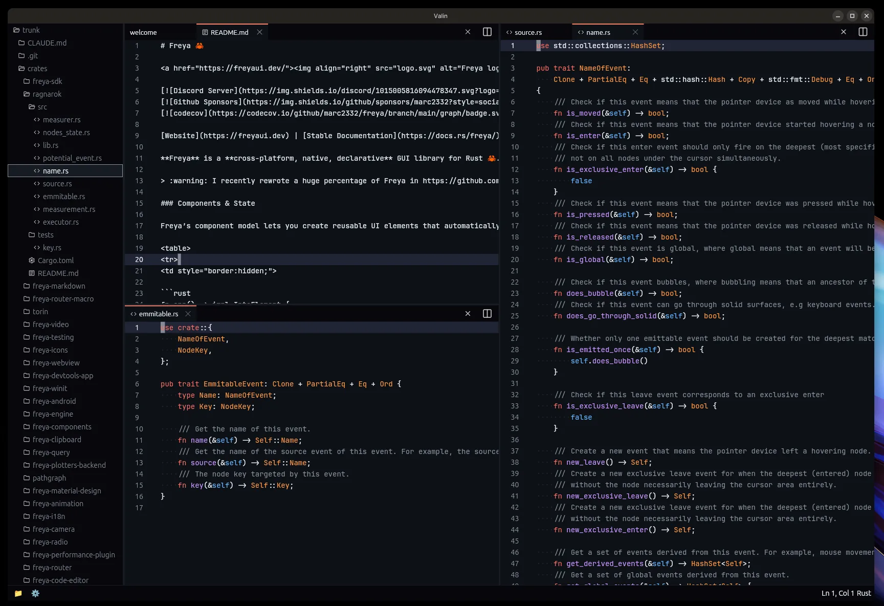
Valin, my code editor made using Freya:
Why the rewrite
Freya originally used Dioxus as its reactive and component engine. Dioxus served Freya really well during the early versions and I am grateful for the foundation it provided. But as Freya grew, the limitations started to show up.
Dioxus is primarily designed around web, things like the rsx!() macro, string-based attributes, and the way components and elements were defined made it harder to provide the kind of type safety, extensibility and simplicity I wanted. Also, depending on a large external framework meant that Freya would be affected by any upstream change and design decision, even if those were not aligned with Freya’s direction.
So I decided to rewrite almost everything in Freya from scratch. The new system is heavily inspired by Dioxus (and React), but tailored specifically for Freya’s needs. It still has hooks, callback event handlers, and a very similar state and async model. But now Freya owns the full stack and can evolve freely.
The start of the rewrite was done in this small PR. And since then I have been fixing bugs and adding new features.
In practice, this rewrite also means a nicer day-to-day: typos in attributes are caught by the compiler instead of at runtime, your IDE actually autocompletes things, and stack traces point at the line you wrote instead of an expanded macro.
A few crates that previously came from the Dioxus ecosystem (I made them all though) have been forked and adapted:
dioxus-radiobecamefreya-radiodioxus-querybecamefreya-querydioxus-i18nbecamefreya-i18ndioxus-clipboardbecamefreya-clipboard
And many crates were reorganized, split, or consolidated:
- New crates:
freya-icons,freya-animation,freya-edit,freya-performance-plugin,freya-query,freya-terminal,freya-webview,freya-code-editor,freya-android,freya-material-design,freya-markdown,freya-router,freya-router-macro,freya-sdk,freya-camera,freya-video,freya-plotters-backend,freya-devtools-app,pathgraph,ragnarok - Removed/redistributed:
freya-hooks,freya-native-core,freya-elements(merged intofreya-core)
The new API
The biggest user-facing change is the removal of the rsx!() macro. In its place, Freya now uses a sort of builder pattern with fully typed attributes.
Here is what a counter looked like in 0.3:
fn app() -> Element {
    let mut count = use_signal(|| 0);

    rsx!(
        rect {
            width: "fill",
            height: "50%",
            main_align: "center",
            cross_align: "center",
            color: "white",
            background: "rgb(15, 163, 242)",
            font_weight: "bold",
            font_size: "75",
            label { "{count}" }
        }
        rect {
            direction: "horizontal",
            width: "fill",
            height: "50%",
            main_align: "center",
            cross_align: "center",
            spacing: "8",
            Button {
                on_press: move |_| count += 1,
                label { "Increase" }
            }
            Button {
                on_press: move |_| count -= 1,
                label { "Decrease" }
            }
        }
    )
}

And here is the same counter in 0.4:
fn app() -> impl IntoElement {
    let mut count = use_state(|| 0);

    let counter = rect()
        .width(Size::fill())
        .height(Size::percent(50.))
        .center()
        .color((255, 255, 255))
        .background((15, 163, 242))
        .font_weight(FontWeight::BOLD)
        .font_size(75.)
        .child(count.read().to_string());

    let actions = rect()
        .horizontal()
        .width(Size::fill())
        .height(Size::percent(50.))
        .center()
        .spacing(8.0)
        .child(
            Button::new()
                .on_press(move |_| {
                    *count.write() += 1;
                })
                .child("Increase"),
        )
        .child(
            Button::new()
                .on_press(move |_| {
                    *count.write() -= 1;
                })
                .child("Decrease"),
        );

    rect().child(counter).child(actions)
}
A few things to notice:
- No macro. Just regular Rust method calls with full IDE support (autocomplete, go-to-definition, etc.)
- Attributes are fully typed. Instead of
width: "fill"you writewidth(Size::fill()). Instead offont_weight: "bold"you writefont_weight(FontWeight::BOLD). This means compile-time errors instead of runtime panics. use_signalis nowuse_state.- Components return
impl IntoElementinstead ofElement. - Strings and
&strautomatically convert to text labels, so"hello"is all you need for simple text, you can still uselabel()for more customization. - Helper methods like
.center(),.horizontal(), and.expanded()make common layout patterns shorter.
See counter.rs for the full example.
Elements
Elements in Freya 0.4 are regular Rust functions that return builders. Each builder has typed methods for every attribute it supports. Here is a quick overview of the core elements:
rect is still the general-purpose container. It supports layout, styling, text properties, events, transforms, and children:
rect()
    .width(Size::fill())
    .height(Size::px(200.))
    .padding(16.)
    .margin(8.)
    .spacing(12.)
    .background((240, 240, 240))
    .border(Border::new().fill((200, 200, 200)).width(1.0).alignment(BorderAlignment::Inner))
    .corner_radius(8.)
    .shadow((0., 2., 4., 0., (0, 0, 0, 25)))
    .opacity(0.9)
    .blur(2.0)
    .direction(Direction::Horizontal)
    .main_align(Alignment::SpaceBetween)
    .cross_align(Alignment::Center)
    .content(Content::Flex)
    .child("Hello!")
label is for simple text:
label()
    .text("Hello, World!")
    .font_size(18.)
    .font_weight(FontWeight::BOLD)
    .color(Color::WHITE)
    .max_lines(1)
    .text_overflow(TextOverflow::Ellipsis)
paragraph supports rich text with multiple spans and cursors:
paragraph()
    .cursor_color(Color::BLUE)
    .highlight_color((100, 149, 237, 100))
    .span(Span::new("Bold text").font_weight(FontWeight::BOLD))
    .span(Span::new(" and normal text"))
Paragraphs can even inline other elements in the middle of the text flow, like images, links or even interactive buttons:
paragraph()
    .span("Lorem ipsum dolor sit amet, consectetur adipiscing elit, sed ")
    .child(ImageViewer::new(logo).width(Size::px(32.)).height(Size::px(32.)))
    .span(" do eiusmod tempor incididunt ut labore ")
See feature_inlined_text_elements.rs for a complete example.
Elements in 0.4 are no longer hardcoded into the framework. Now anyone can implement the ElementExt trait to define a fully custom element with its own layout, rendering, and diffing behavior. This is the exact same API that powers all of Freya’s built-in elements (rect, paragraph, label, image) and also more specialized ones like GifViewer, WebView, etc. See feature_element.rs for a complete example.
Layout
Freya’s layout library (Torin) now allows containers to wrap their children into new rows or columns with Content::wrap(), optionally separating the wrapped lines with Content::wrap_spacing():
rect()
    .horizontal()
    .content(Content::wrap_spacing(10.))
    .spacing(10.)
    .width(Size::fill())
    .children(cards())
See layout_content_wrap.rs and layout_alignments.rs for complete examples.
Text editing
For building your own inputs and editors, Freya provides a low-level text editing API. use_editable manages the cursor, selection, and edit history over a paragraph(), and you drive it by forwarding pointer and keyboard events as EditableEvents. The built-in Input and CodeEditor are both built on top of it.
See text_editing.rs for a complete example.
Components
Components in Freya are any data type that implements the Component trait. In practice, you define a struct with your props, derive PartialEq (so the framework can diff them), and implement render:
#[derive(PartialEq)]
struct Card(Task);

impl Component for Card {
    fn render(&self) -> impl IntoElement {
        let animation = use_animation(|conf| {
            conf.on_creation(OnCreation::Run);
            AnimNum::new(0.8, 1.)
                .time(500)
                .function(Function::Expo)
                .ease(Ease::Out)
        });

        rect()
            .background((255, 255, 255))
            .border(Border::new().fill((200, 200, 200)).width(1.0).alignment(BorderAlignment::Inner))
            .corner_radius(4.0)
            .padding(12.0)
            .width(Size::px(200.))
            .height(Size::px(60.))
            .scale(animation.read().value())
            .shadow((0., 2., 4., 0., (0, 0, 0, 25)))
            .child(label().text(self.0.title.clone()))
    }
}
The render_key() method helps the framework with reconciliation when rendering lists of components. This is similar to the key prop in React:
impl Component for StoryItem {
    fn render(&self) -> impl IntoElement {
        // ...
    }

    fn render_key(&self) -> DiffKey {
        DiffKey::from(&self.id)
    }
}
For simple cases, you can still use plain functions that return impl IntoElement. And for the root component of your app, there is also an App trait:
struct MyApp {
    value: u8,
}

impl App for MyApp {
    fn render(&self) -> impl IntoElement {
        format!("Value is {}", self.value)
    }
}

fn main() {
    launch(LaunchConfig::new().with_window(WindowConfig::new_app(MyApp { value: 4 })))
}
See feature_struct_component.rs for a complete example.
State management
use_state
The core of state management is use_state. It creates reactive state that automatically notifies readers when modified:
let mut count = use_state(|| 0);

// Reading (subscribes the component to changes)
let value = count.read();
let value = count();  // Same as .read(), shorthand for Copy types

// Reading without subscribing
let value = count.peek();

// Writing (notifies readers)
*count.write() += 1;
count.set(42);
count.toggle();  // For booleans
count.set_if_modified(new_value);  // Only updates if value differs
count.with_mut(|mut value| *value += 1);  // Modify with closure
For multi-window apps, you can create global state that lives outside any component:
let count = State::create_global(0); // Do this in your main functionSee state_local.rs for a complete example.
use_memo
Memoize expensive computations that automatically rerun when their dependencies change:
let doubled = use_memo(move || count.read() * 2);use_side_effect
Run side effects when reactive values change:
use_side_effect(move || {
    println!("Count changed to: {}", count.read());
});
There is also use_side_effect_with_deps for explicit dependency tracking:
use_side_effect_with_deps(&some_prop, move |prop| {
    println!("Prop changed to: {:?}", prop);
});
See lifecycle_effect.rs for a complete example.
use_future
Manage async tasks with loading states:
let data = use_future(move || async move {
    fetch_data().await
});

let message = match &*data.state() {
    FutureState::Pending => "Not started".into_element(),
    FutureState::Loading => "Loading...".into_element(),
    FutureState::Fulfilled(result) => format!("Got: {result}").into_element(),
};
See lifecycle_future_task.rs for a complete example.
use_consume
Pass data down the component tree without prop drilling:
// Provider
use_provide_context(|| MyThemeConfig::default());

// Consumer (anywhere in the subtree)
let theme = use_consume::<MyThemeConfig>();

// Optional consumer
let maybe_theme = use_try_consume::<MyThemeConfig>();
See state_shared.rs for a complete example.
Dynamic rendering
Since there is no macro, dynamic rendering works through regular Rust patterns. You can use .maybe_child() for conditional children:
fn app() -> impl IntoElement {
    let mut show = use_state(|| false);

    rect().center().expanded().child(
        Attached::new(
            Button::new()
                .child("Toggle")
                .on_press(move |_| show.toggle()),
        )
        .maybe_child(show().then(|| rect().child(Button::new().child("Attached")))),
    )
}
And .children() accepts iterators for dynamic lists:
rect().children((0..5).map(|i| {
    label().key(i).text(format!("Item {i}")).into()
}))
The .map() method lets you conditionally modify an element based on a value:
Button::new()
    .child(story.title.clone())
    .map(url, |el, url| {
        el.on_press(move |_| {
            let _ = open::that(&url);
        })
    })
See component_attached.rs and lists.rs for full examples.
Virtualization
For long lists, VirtualScrollView only renders the items currently visible. You give it a builder closure for each index plus the total length() and the item_size().
fn app() -> impl IntoElement {
    VirtualScrollView::new(|i, _| {
        rect()
            .key(i)
            .height(Size::px(50.))
            .padding(4.)
            .child(
                rect()
                    .width(Size::fill())
                    .height(Size::fill())
                    .padding(4.)
                    .corner_radius(8.)
                    .color((255, 255, 255))
                    .background((0, 119, 182))
                    .child(format!("Item {i}")),
            )
            .into()
    })
    .length(300usize)
    .item_size(50.)
    .height(Size::percent(100.))
}
See the example in component_virtual_scrollview.rs.
Events
Freya comes with a bunch of types of events, pointer, mouse, touch, keyboard, wheel, file dragging and styling/layout resolution.
rect()
    .on_press(|e: Event<PressEventData>| {
        e.stop_propagation();
    })
    .on_mouse_down(|e: Event<MouseEventData>| {
        let _pos = e.element_location;
    })
    .on_key_down(|e: Event<KeyboardEventData>| {
        if e.key == Key::Named(NamedKey::Enter) {
            // ...
        }
    })
The same pattern is available for the rest of the events:
- Pointer:
.on_pointer_enter,.on_pointer_leave,.on_pointer_down, … (unified mouse + touch) - Mouse:
.on_mouse_up,.on_mouse_move, … - Wheel:
.on_wheel - Touch:
.on_touch_start,.on_touch_move,.on_touch_end - File drag and drop:
.on_file_drop,.on_global_file_hover,.on_global_file_hover_cancelled - Layout:
.on_sized(fires when an element’s layout values change) - Styled:
.on_styled(fires when an element’s style is computed)
There are also global event variants like .on_global_pointer_press() and .on_global_key_down() that fire regardless of which element has focus.
See event_propagation.rs for a complete example.
Multi-window support
Freya now supports multiple windows, and even with shared state. You can create global state that is accessible from any window and spawn new windows at runtime:
fn main() {
    let count = State::create_global(0);
    launch(LaunchConfig::new().with_window(WindowConfig::new(move || app(count))))
}

fn app(count: State<i32>) -> impl IntoElement {
    let on_open = move |_| {
        spawn(async move {
            Platform::get()
                .launch_window(WindowConfig::new(move || sub_app(count)))
                .await;
        });
    };

    rect()
        .expanded()
        .center()
        .child(Button::new().on_press(on_open).child("Open"))
}
sub_app is just another function returning impl IntoElement. All windows share the same count state, so incrementing from one window updates the others. See feature_multi_window.rs for the full example.
WindowConfig provides configuration for the most common settings you will need for windows:
WindowConfig::new(app)
    .with_size(800., 600.)
    .with_min_size(400., 300.)
    .with_max_size(1920., 1080.)
    .with_title("My App")
    .with_decorations(false)
    .with_transparency(true)
    .with_background(Color::TRANSPARENT)
    .with_resizable(true)
    .with_icon(LaunchConfig::window_icon(ICON))
    .with_on_close(|ctx, window_id| {
        // Decide whether to close or keep open
        CloseDecision::Close
    })
See window_customization.rs for a complete example.
There are also APIs for driving the event loop from async code. LaunchConfig::with_future runs a future alongside the app, and proxy.post_callback gives it access to the winit event loop, so you can enumerate monitors, spawn windows from background tasks, and more:
launch(LaunchConfig::new().with_future(|proxy| async move {
    let monitors: Vec<MonitorHandle> = proxy
        .post_callback(|ctx| ctx.active_event_loop.available_monitors().collect())
        .await
        .unwrap();

    // Open one window per monitor
}))
See feature_multi_monitor.rs, feature_background_tasks.rs and feature_custom_event_loop.rs.
System tray
Freya now supports system tray icons with menus. You can run your app entirely from the tray, or combine tray functionality with regular windows:
fn main() {
    let tray_icon = || {
        let tray_menu = Menu::new();
        let _ = tray_menu.append(&MenuItem::with_id("open", "Open", true, None));
        let _ = tray_menu.append(&MenuItem::with_id(
            "toggle-visibility", "Toggle Visibility", true, None,
        ));
        let _ = tray_menu.append(&MenuItem::with_id("exit", "Exit", true, None));
        TrayIconBuilder::new()
            .with_menu(Box::new(tray_menu))
            .with_tooltip("Freya Tray")
            .with_icon(LaunchConfig::tray_icon(ICON))
            .build()
            .unwrap()
    };

    let tray_handler = |ev, mut ctx: RendererContext| match ev {
        TrayEvent::Menu(MenuEvent { id }) if id == "open" => {
            ctx.launch_window(WindowConfig::new(app).with_size(500., 450.));
        }
        // ... handle the other menu items (toggle visibility, exit, ...)
        _ => {}
    };

    launch(LaunchConfig::new().with_tray(tray_icon, tray_handler))
}
See feature_tray.rs for the full example with all the menu items handled.
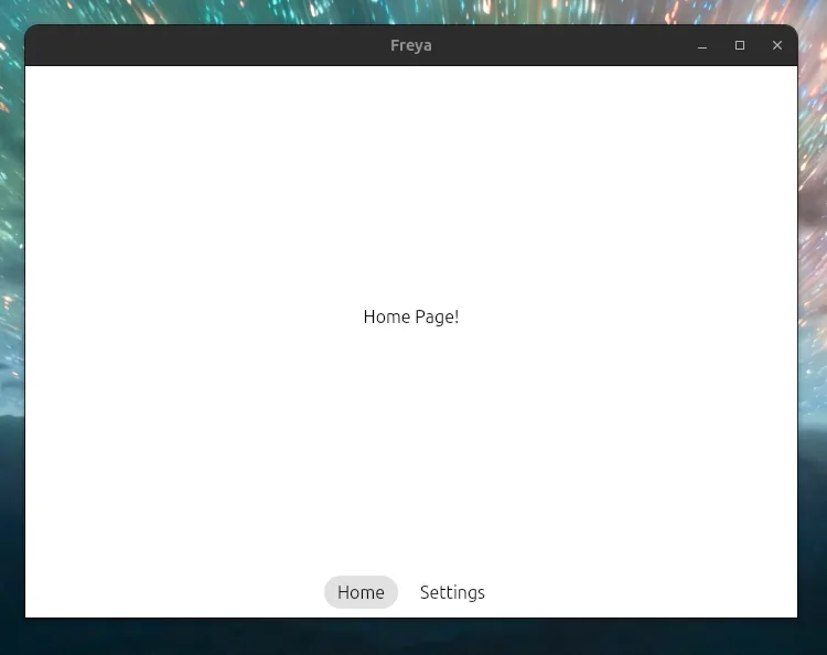
Router
The freya-router crate provides client-side routing with nested layouts, route parameters, and programmatic navigation. Routes are defined with a derive macro:
#[derive(Routable, Clone, PartialEq)]
pub enum Route {
    #[layout(AppLayout)]
        #[route("/")]
        Home,
        #[route("/about")]
        About,
        #[nest("/users/:user_id")]
            #[layout(UserLayout)]
                #[route("/")]
                UserDetail { user_id: String },
                #[route("/posts")]
                UserPosts { user_id: String },
}
Each route variant maps to a component with the same name. Layout components wrap their children and render an Outlet for the active route:
#[derive(PartialEq)]
struct AppLayout;
impl Component for AppLayout {
    fn render(&self) -> impl IntoElement {
        rect()
            .native_router()
            .content(Content::flex())
            .child(
                rect()
                    .horizontal()
                    .height(Size::px(50.))
                    .background((230, 230, 230))
                    .padding(12.)
                    .spacing(12.)
                    .cross_align(Alignment::center())
                    .child(
                        ActivableRoute::new(
                            Route::Home,
                            Link::new(Route::Home).child(Button::new().flat().child("Home")),
                        )
                        .exact(true),
                    )
                    .child(
                        ActivableRoute::new(
                            Route::About,
                            Link::new(Route::About).child(Button::new().flat().child("About")),
                        )
                        .exact(true),
                    )
                    .child(rect().width(Size::flex(1.)))
                    .child(
                        Button::new()
                            .flat()
                            .on_press(|_| RouterContext::get().go_back())
                            .child("Go Back"),
                    ),
            )
            .child(rect().expanded().padding(12.).child(Outlet::<Route>::new()))
    }
}
See feature_router.rs for a complete example, or feature_router_complex.rs for nested routes and layouts.
Radio (global state)
For apps with complex state needs, the freya-radio crate provides a channel-based global state system. You define your state, your channels, and then subscribe individual components to specific channels. Only the components subscribed to a channel that gets notified will re-render:
#[derive(Default)]
struct Data {
    pub lists: Vec<Vec<String>>,
}

#[derive(PartialEq, Eq, Clone, Debug, Copy, Hash)]
pub enum DataChannel {
    ListCreation,
    SpecificListItemUpdate(usize),
}

impl RadioChannel<Data> for DataChannel {}

fn app() -> impl IntoElement {
    use_init_radio_station::<Data, DataChannel>(Data::default);
    let mut radio = use_radio::<Data, DataChannel>(DataChannel::ListCreation);

    rect()
        .horizontal()
        .child(
            Button::new()
                .on_press(move |_| radio.write().lists.push(Vec::default()))
                .child("Add new list"),
        )
        .children(
            radio
                .read()
                .lists
                .iter()
                .enumerate()
                .map(|(list_n, _)| ListComp(list_n).into()),
        )
}

#[derive(PartialEq)]
struct ListComp(usize);
impl Component for ListComp {
    fn render(&self) -> impl IntoElement {
        let list_n = self.0;
        let mut radio = use_radio::<Data, DataChannel>(DataChannel::SpecificListItemUpdate(list_n));

        rect()
            .child(
                Button::new()
                    .on_press(move |_| {
                        radio.write().lists[list_n].push("Hello, World".to_string())
                    })
                    .child("New Item"),
            )
            .children(
                radio.read().lists[list_n]
                    .iter()
                    .enumerate()
                    .map(move |(i, item)| label().key(i).text(item.clone()).into()),
            )
    }
}
Writing to radio state through radio.write() automatically notifies subscribers on the relevant channel. You can also select a specific channel to notify, or write silently without notifying anyone.
See state_radio.rs for a complete example.
Theming
Freya ships with a full theming system. Built-in themes include dark_theme and light_theme, and every built-in component respects the active theme:
fn app() -> impl IntoElement {
    use_init_theme(dark_theme); // All components in this tree will use the dark theme

    rect()
        .theme_background()  // Uses the theme's background color
        .child(Button::new().child("Themed button"))
}
The Theme struct contains a ColorsSheet with semantic colors (primary, secondary, success, warning, error, etc.), surface colors, border colors, text colors, and state colors (focus, active, disabled). Each built-in component also has its own theme preferences for layout and colors.
You can switch themes at runtime and even detect the system preferred theme:
let platform = Platform::get();
let prefers_dark = *platform.preferred_theme.read() == PreferredTheme::Dark;
The OS accent color is exposed as well through Platform::get().accent_color.
Theme helper methods on elements like .theme_background() and .theme_accent_color() make it easy to use theme colors without manual lookups.
See theme_switcher.rs and theme_preference.rs for complete examples.
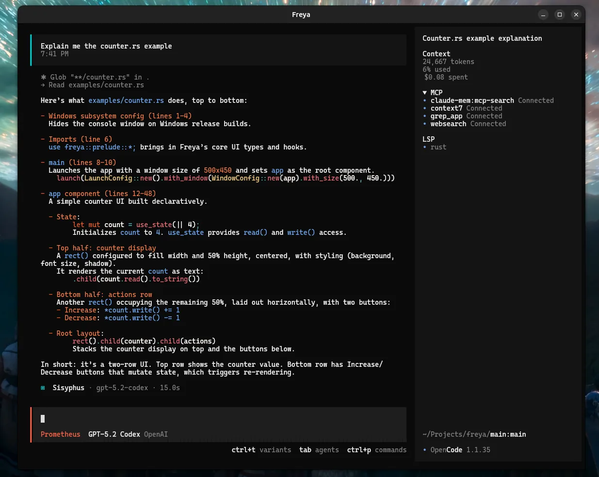
Terminal emulator
The freya-terminal crate lets you embed a fully functional terminal emulator inside your Freya app. It supports mouse events, keyboard input, clipboard integration, window title updates, and more:
fn app() -> impl IntoElement {
    let mut handle = use_state(|| {
        let mut cmd = CommandBuilder::new("bash");
        cmd.env("TERM", "xterm-256color");
        cmd.env("COLORTERM", "truecolor");
        TerminalHandle::new(TerminalId::new(), cmd, None).ok()
    });

    let a11y_id = use_a11y();

    rect().expanded().child(if let Some(handle) = handle.read().clone() {
        Terminal::new(handle.clone())
            .a11y_id(a11y_id)
            .a11y_role(AccessibilityRole::Terminal)
            .a11y_auto_focus(true)
            .on_key_down(move |e: Event<KeyboardEventData>| {
                let _ = handle.write_key(&e.key, e.modifiers);
            })
            .into_element()
    } else {
        "Terminal exited".into_element()
    })
}
Check the full terminal example for mouse handling, clipboard, and title tracking.
WebView (experimental)
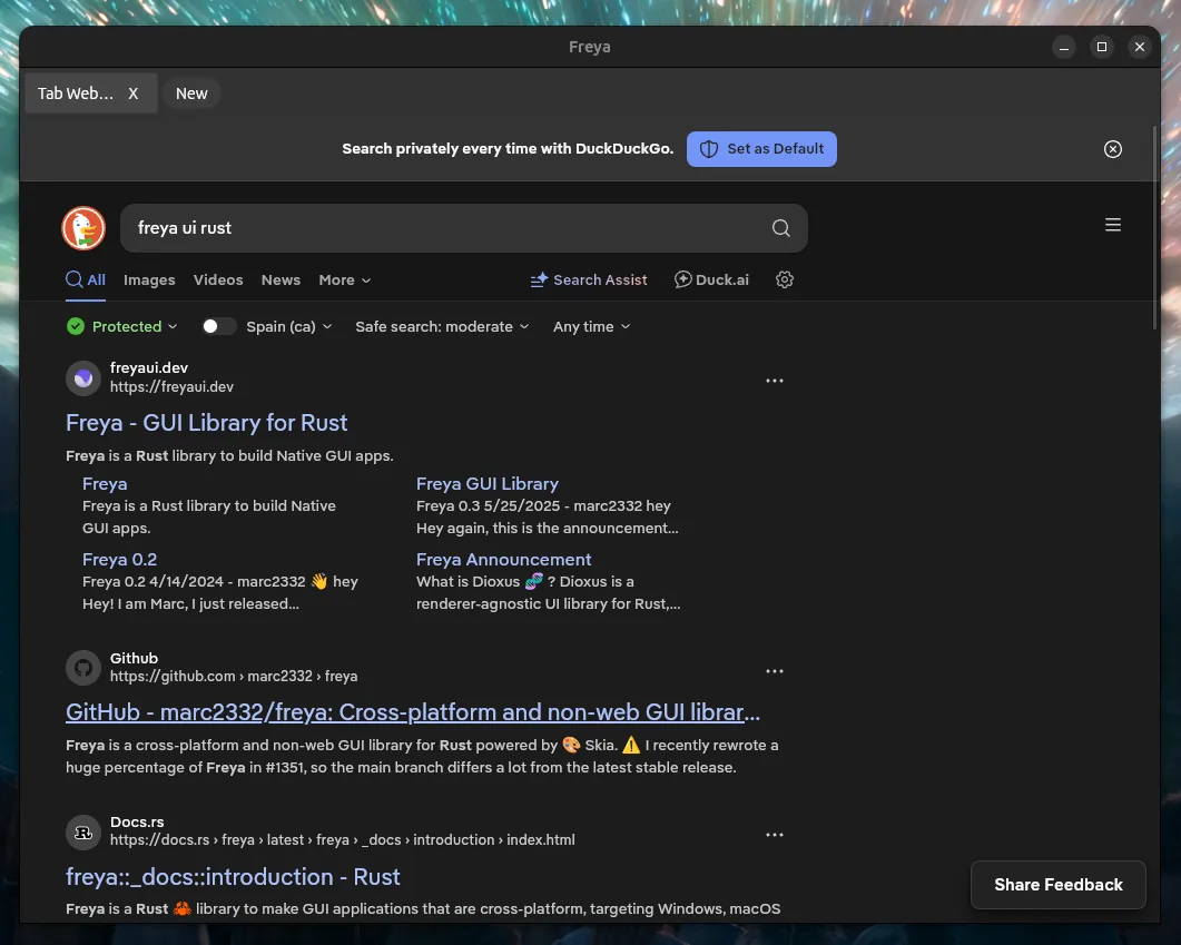
freya-webview is an experimental crate that embeds native web views (backed by WRY). After registering the WebViewPlugin, a WebView element renders a live browser surface anywhere in the tree:
fn main() {
    launch(
        LaunchConfig::new()
            .with_plugin(WebViewPlugin::new())
            .with_window(WindowConfig::new(app)),
    )
}

fn app() -> impl IntoElement {
    WebView::new("https://duckduckgo.com").expanded()
}
Each web view is identified by a WebViewId, so you can drive multi-tab setups, keep instances around with .close_on_drop(false), and dispose of them explicitly with WebViewManager::close(id):
WebView::new(&url)
    .expanded()
    .id(tab.id)
    .close_on_drop(false)
See feature_webview.rs for a tabbed browser. It lives behind the webview feature flag.
Loading data asynchronously with queries
The freya-query crate brings a system similar to tanstack-query for data fetching in Freya. You define queries with a run method that does a specific action, and the crate handles caching, loading states, re-fetching and error handling for you.
Here is a real example from the Hacker News app:
#[derive(Clone, PartialEq, Hash, Eq)]
struct GetStory;

impl QueryCapability for GetStory {
    type Ok = Story;
    type Err = Error;
    type Keys = i64;

    async fn run(&self, id: &Self::Keys) -> Result<Self::Ok, Self::Err> {
        let url = format!("https://hacker-news.firebaseio.com/v0/item/{}.json", id);
        let story = blocking::unblock(move || {
            let response = ureq::get(&url).call().map_err(|e| Box::new(e) as Error)?;
            let data = response.into_body().read_to_vec().map_err(|e| Box::new(e) as Error)?;
            serde_json::from_slice::<Story>(&data).map_err(|e| Box::new(e) as Error)
        }).await?;
        Ok(story)
    }
}

#[derive(PartialEq)]
struct StoryItem { id: i64 }

impl Component for StoryItem {
    fn render(&self) -> impl IntoElement {
        let story_query = use_query(
            Query::new(self.id, GetStory)
                .stale_time(Duration::from_secs(600))  // Cache for 10 minutes
        );

        match &*story_query.read().state() {
            QueryStateData::Pending | QueryStateData::Loading { .. } => {
                rect().center().child("Loading story...").into_element()
            }
            QueryStateData::Settled { res: Ok(story), .. } => {
                Button::new()
                    .width(Size::fill())
                    .child(
                        rect()
                            .padding((8.0, 16.0))
                            .child(story.title.clone())
                            .child(format!("{} points by {}", story.score, story.by))
                    )
                    .into_element()
            }
            QueryStateData::Settled { res: Err(e), .. } => {
                rect().color((255, 0, 0)).child(format!("Error: {}", e)).into_element()
            }
        }
    }

    fn render_key(&self) -> DiffKey {
        DiffKey::from(&self.id)
    }
}
Queries are not limited to network requests, see state_query_sqlite for queries backed by a SQLite database.
Drag and drop
The DragZone and DropZone components make drag and drop very simple to use. A drop zone wraps any element and receives a typed payload when a matching drag zone is released over it:
DropZone::<usize>::new(
    rect()
        .padding(16.0)
        .children(tasks.read().iter().map(|task| {
            DragZone::<usize>::new(task.id, Card(task.clone()))
                .show_while_dragging(false)
                .key(task.id)
                .into()
        })),
    move |task_id: usize| {
        // move task to this column
    },
)
See component_drag_drop.rs for a complete example.
Portal
The Portal component animates an element from one place to another. You wrap your element in Portal::new(id) and, when a portal with the same id shows up somewhere else in the app, the element smoothly moves from its old position to the new one. You can tweak the easing and duration.
See the kanban board example, where cards animate between columns as you drag them or also this portal example:
Animations
The animation system has been reworked into its own freya-animation crate. You can animate numbers, colors, and sequences with configurable easing functions.

Animating a position with elastic easing using use_animation:
fn app() -> impl IntoElement {
    let mut animation = use_animation(|_| {
        AnimNum::new(50., 550.)
            .function(Function::Elastic)
            .ease(Ease::Out)
            .time(1500)
    });

    let value = animation.read().value();

    rect()
        .child(
            rect()
                .position(Position::new_absolute().left(value).top(50.))
                .background(Color::BLUE)
                .width(Size::px(100.))
                .height(Size::px(100.)),
        )
        .child(
            rect()
                .horizontal()
                .center()
                .spacing(8.0)
                .child(Button::new().on_press(move |_| animation.start()).child("Start"))
                .child(Button::new().on_press(move |_| animation.reverse()).child("Reverse")),
        )
}
There is also use_animation_transition for smooth transitions between state changes:
fn app() -> impl IntoElement {
    let mut color = use_state(random_color);
    let animation =
        use_animation_transition(color, |from: Color, to| AnimColor::new(from, to).time(500));

    rect()
        .background(&*animation.read())
        .expanded()
        .center()
        .child(
            Button::new()
                .on_press(move |_| color.set(random_color()))
                .child("Random"),
        )
}
Animations can auto-start on creation, reverse on finish, or restart in a loop:
use_animation(|conf| {
    conf.on_creation(OnCreation::Run);
    AnimNum::new(0.8, 1.)
        .time(500)
        .function(Function::Expo)
        .ease(Ease::Out)
})
See animation_position.rs and animation_transition.rs for complete examples.
Canvas
For custom drawing, the canvas() element gives you direct access to the Skia canvas:
fn app() -> impl IntoElement {
    canvas(RenderCallback::new(|context| {
        let center_x = context.size.width / 2.0;
        let center_y = context.size.height / 2.0;

        let mut paint = Paint::default();
        paint.set_anti_alias(true);
        paint.set_style(PaintStyle::Fill);
        paint.set_color(Color::BLUE);

        context.canvas.draw_circle((center_x, center_y), 50.0, &paint);
    }))
    .expanded()
}
See feature_canvas.rs for a complete example.
Shaders
Any element can also use a runtime SkSL shader as its fill through ShaderFill. You provide the shader source and a closure that feeds it uniforms on every render:
let shader_fill = use_hook(|| {
    let now = std::time::Instant::now();
    ShaderFill::new(
        SHADER,
        RuntimeEffect::make_for_shader(SHADER, None).expect("shader compilation failed"),
        move |effect, bounds| {
            effect.make_shader(
                Data::new_copy(
                    &[
                        bounds.width().to_le_bytes(),
                        bounds.height().to_le_bytes(),
                        0.0f32.to_le_bytes(),
                        now.elapsed().as_secs_f32().to_le_bytes(),
                    ]
                    .concat(),
                ),
                &[],
                None,
            )
        },
    )
});

rect().expanded().background(shader_fill)
Combined with RenderingTicker you can update the uniforms every frame and get live animated backgrounds. See style_shader_fill.rs for the animated version, or shader_editor.rs for a small live shader editor built on top of it. The Skia APIs are re-exported through the engine feature flag.
Charts (Plotters)
The freya-plotters-backend crate wires the Plotters charting library into Freya’s Skia canvas. You draw any Plotters chart straight onto a canvas() element by building a PlotSkiaBackend from the render context:
canvas(RenderCallback::new(|ctx| {
    let backend = PlotSkiaBackend::new(
        ctx.canvas,
        ctx.font_collection,
        (ctx.size.width as i32, ctx.size.height as i32),
    )
    .into_drawing_area();

    backend.fill(&WHITE).unwrap();

    let mut chart = ChartBuilder::on(&backend)
        .caption("Chart", ("sans", 20))
        .build_cartesian_2d(-3.0..3.0, -3.0..3.0)
        .unwrap();

    chart
        .draw_series(LineSeries::new(
            (-100..100).map(|x| x as f64 / 40.0).map(|x| (x, x.sin())),
            &BLACK,
        ))
        .unwrap();
}))
.expanded()
Since it is just Plotters, 2D and 3D charts, surfaces, legends, and the rest of its API all work. See feature_plot_3d.rs for an interactive 3D surface that follows the cursor.
Camera
The freya-camera crate lets you capture and display webcam feeds. use_camera opens a device and CameraViewer renders the frames, with the same loading and error placeholders you get from ImageViewer:
fn app() -> impl IntoElement {
    let camera = use_camera(|| CameraConfig::new());

    CameraViewer::new(camera)
        .corner_radius(12.)
        .loading_placeholder(label().text("Opening camera...").color(Color::WHITE))
        .error_renderer(|err: CameraError| {
            label().color((255, 120, 120)).text(format!("Camera error: {err}")).into()
        })
}
You can enumerate the available devices with query() and select one by passing its CameraIndex to CameraConfig::new().device(index). Camera access is requested through freya::camera::init() at startup.
See feature_camera.rs for a device picker.
Video
The freya-video crate plays video files (decoded with FFmpeg) and exposes the decoded frames as images you can render anywhere. use_video opens a source and gives you a player handle, and player.frame() returns the current frame:
fn main() {
    ensure_ffmpeg().expect("failed to prepare ffmpeg");
    launch(LaunchConfig::new().with_window(WindowConfig::new(app)))
}

fn app() -> impl IntoElement {
    let player = use_video(|| "./video.mp4".to_string());

    rect().expanded().center().child(match player.frame() {
        Some(frame) => image(frame).expanded().aspect_ratio(AspectRatio::Min).into(),
        None => CircularLoader::new().into_element(),
    })
}
The same handle drives a full player: player.toggle() to play/pause, player.seek(...), and player.progress(), player.position(), player.duration(), player.set_volume(...) for the controls. See component_video.rs for a complete player with a play button, seek slider, and volume. It lives behind the video feature flag.
Transform effects
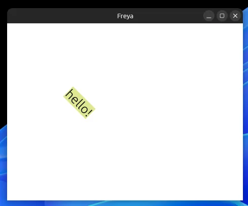
Elements support transform effects:
rect()
    .expanded()
    .center()
    .offset_x(-50.) // Shift the children left by 50 and down by 25
    .offset_y(25.)
    .scale(0.5) // Shrink to half the size
    .rotate(45.) // Rotate 45 degrees clockwise
    .child(
        rect()
            .font_size(50.)
            .background((222, 231, 145))
            .child("hello!"),
    )
See feature_transform.rs for the example.
Internationalization (i18n)
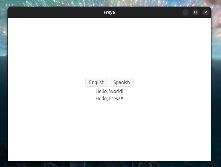
The freya-i18n crate provides full internationalization using the Fluent translation format. Locales can be embedded at compile time or loaded from files at runtime:
fn app() -> impl IntoElement {
    let mut i18n = use_init_i18n(|| {
        I18nConfig::new(langid!("en-US"))
            .with_locale((langid!("en-US"), include_str!("./i18n/en-US.ftl")))
            .with_locale((langid!("es-ES"), PathBuf::from("./examples/i18n/es-ES.ftl")))
    });

    let change_to_english = move |_| i18n.set_language(langid!("en-US"));
    let change_to_spanish = move |_| i18n.set_language(langid!("es-ES"));

    rect()
        .expanded()
        .center()
        .spacing(6.)
        .child(
            rect()
                .spacing(6.)
                .horizontal()
                .child(Button::new().on_press(change_to_english).child("English"))
                .child(Button::new().on_press(change_to_spanish).child("Spanish")),
        )
        .child(t!("hello_world"))
        .child(t!("hello", name: "Freya!"))
}
The t!() macro translates keys with optional arguments. Language switching is instant and all subscribed components update automatically. See feature_i18n.rs for the full example.
Icons
The freya-icons crate provides access to the SVGs of the Lucide icon library (the only one for now):
use freya::icons;

rect()
    .horizontal()
    .main_align(Alignment::SpaceEvenly)
    .cross_align(Alignment::Center)
    .expanded()
    .child(
        SvgViewer::new(icons::lucide::antenna())
            .theme_accent_color()
            .width(Size::px(100.))
            .height(Size::px(100.)),
    )
    .child(
        SvgViewer::new(icons::lucide::shield())
            .color((120, 50, 255))
            .stroke_width(4.0)
            .width(Size::px(100.))
            .height(Size::px(100.)),
    )
See feature_icons.rs for a complete example.
Code editor
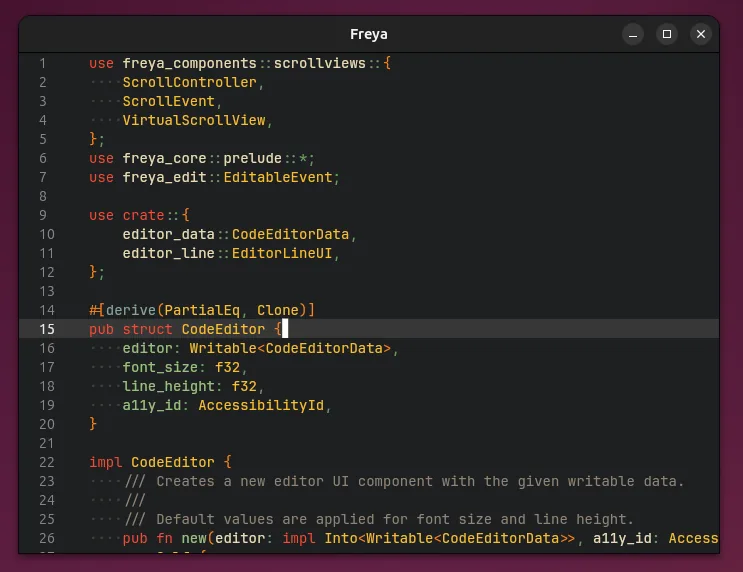
The freya-code-editor crate provides a full syntax-highlighted code editor component with language support and customizable themes:
fn app() -> impl IntoElement {
    use_init_theme(|| dark_theme().with_dark_code_editor());
    let a11y_id = use_a11y();

    let editor = use_state(move || {
        let rope = Rope::from_str(&std::fs::read_to_string("./src/main.rs").unwrap());
        let language = EditorLanguage::new(
            tree_sitter_rust::LANGUAGE,
            tree_sitter_rust::HIGHLIGHTS_QUERY,
        );
        let mut editor = CodeEditorData::new(rope, language);
        editor.set_theme(EditorSyntaxTheme {
            comment: (230, 230, 230).into(),
            ..EditorSyntaxTheme::dark()
        });
        editor.parse();
        editor.measure(14., "Jetbrains Mono");
        editor
    });

    CodeEditor::new(editor, a11y_id).background((20, 20, 20))
}
See feature_code_editor.rs for the full example.
It’s what powers my code editor Valin too (see Personal apps).
Docking
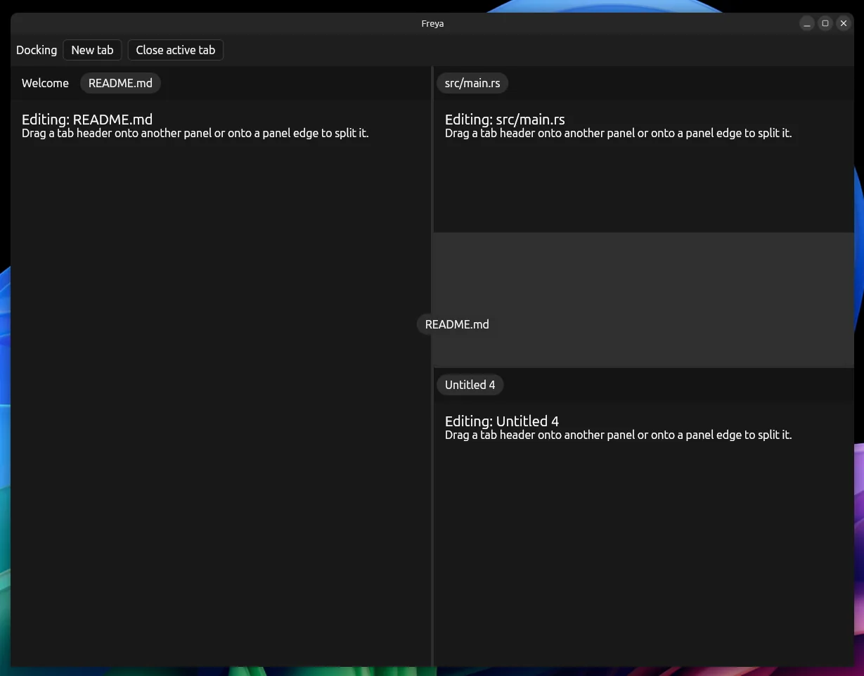
The new DockingArea component lets you build IDE-like layouts where tabs live inside panels, and panels can be split, resized, and rearranged by dragging tabs around, onto other panels or onto a panel edge to split it.
You own the layout data and you describe how to read and mutate that tree by implementing the DockingModel trait. DockingArea takes care of the rendering and drag-and-drop, calling back into your model when the user drops a tab.
// Your layout, a tree of panels and splits, keyed by your own ids.
struct Workspace {
    tree: Option<DockNode<TabId, PanelId>>,
}

impl DockingModel for Workspace {
    type TabId = TabId;
    type PanelId = PanelId;
    type DropValue = TabId;

    // The current tree, or `None` when there are no panels.
    fn root(&self) -> Option<&DockNode<TabId, PanelId>> {
        self.tree.as_ref()
    }

    // Called when a tab is dropped. Move it, or split a panel to make room.
    fn on_drop(&mut self, tab_id: TabId, target: DropTarget<PanelId>) -> bool {
        let Some(tree) = self.tree.as_mut() else {
            return false;
        };
        match target {
            DropTarget::Center(panel_id) | DropTarget::Tab { panel_id, .. } => {
                if let Some(panel) = tree.panel_mut(&panel_id) {
                    panel.append_tab(tab_id);
                }
                tree.remove_tab_except(&tab_id, Some(&panel_id));
            }
            DropTarget::Split { panel_id, side } => {
                let new_panel = DockPanel::new(next_panel_id(), vec![tab_id]);
                tree.split_panel(&panel_id, side, &new_panel);
            }
        }
        true
    }

    // Make `tab_id` the focused one inside `panel_id`.
    fn set_active(&mut self, panel_id: PanelId, tab_id: TabId) -> bool {
        let Some(panel) = self.tree.as_mut().and_then(|tree| tree.panel_mut(&panel_id)) else {
            return false;
        };
        panel.active_tab_id = Some(tab_id);
        true
    }
}

fn app() -> impl IntoElement {
    let workspace = use_state(|| Workspace {
        tree: Some(DockNode::Split {
            direction: Direction::Horizontal,
            children: vec![
                DockNode::Panel(DockPanel::new(0, vec![1, 2])),
                DockNode::Panel(DockPanel::new(1, vec![3])),
            ],
        }),
    });

    DockingArea::new(
        workspace.into_writable(),
        // The body of the active tab in a panel, if any.
        |ctx: ContentContext<TabId, PanelId>| {
            rect()
                .expanded()
                .maybe_child(ctx.tab_id.map(|tab_id| format!("Tab {tab_id}")))
                .into_element()
        },
        // A tab header.
        |ctx: TabContext<TabId>| {
            FloatingTab::new().child(format!("Tab {}", ctx.tab_id)).into_element()
        },
        // The drag preview that follows the cursor.
        |tab_id: TabId| FloatingTab::new().child(format!("Tab {tab_id}")).into_element(),
        // The bar that lays out the tab headers of a panel.
        |ctx: TabBarContext<PanelId>| {
            rect().horizontal().children(ctx.tab_children).into_element()
        },
    )
}
The DockNode tree comes with helpers for the common operations (panel_mut, append_tab, insert_tab, split_panel, remove_tab_except, close_empty_panels), so most of your DockingModel ends up being a thin layer over them. Check out component_docking.rs for a complete workspace with new/close tab buttons and empty-panel collapsing.
Testing
Freya includes a headless testing runner that lets you write automated tests for your UI without opening a window. You can simulate clicks, keyboard input, and even make “screenshots”:
use freya_testing::TestingRunner;

fn main() {
    let (mut test, state) = TestingRunner::new(
        app,
        (300., 300.).into(),
        |runner| runner.provide_root_context(|| State::create(0)),
        1.,
    );

    // Process layout and render
    test.sync_and_update();
    assert_eq!(*state.peek(), 0);

    // Simulate a click
    test.click_cursor((15., 15.));
    assert_eq!(*state.peek(), 1);

    // Save a screenshot
    test.render_to_file("./demo-1.png");
}
See feature_testing.rs for a complete example.
This also works for snapshot testing. You can render your UI at different states and compare the results:
let (mut runner, _) = TestingRunner::new(app, Size2D::new(500., 500.), |_| {}, 1.);
runner.render_to_file("./snapshot-before.png");
runner.click_cursor((270., 100.));
runner.render_to_file("./snapshot-after.png");
See feature_snapshot.rs for the full example.

Built-in components
Freya ships with 45+ built-in components. Here are some of them:
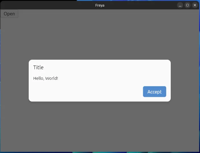
Popup
let mut show_popup = use_state(|| false);

Popup::new()
    .on_close_request(move |_| show_popup.set(false))
    .maybe(show_popup(), |popup| {
        popup
            .child(PopupTitle::new("Title".to_string()))
            .child(PopupContent::new().child("Hello, World!"))
            .child(
                PopupButtons::new().child(
                    Button::new()
                        .on_press(move |_| show_popup.set(false))
                        .expanded()
                        .filled()
                        .child("Accept"),
                ),
            )
    })
See component_popup.rs for a complete example.
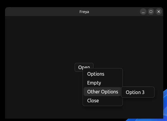
ContextMenu
Easily open floating menus from anywhere in your app.
Make sure that you call
ContextMenuViewer::new()in an ancestor of wherever you open the menus, e.g. near the root of your app, that’s the slot that will be used to render the context menus.
fn context_menu() -> Menu {
    Menu::new()
        .child(
            SubMenu::new()
                .child(MenuButton::new().child("Option 1"))
                .child(MenuButton::new().child("Option 2"))
                .label("Options"),
        )
        .child(MenuButton::new().child("Close").on_press(move |_| ContextMenu::close()))
}

// Open from any press event
Button::new().on_press(move |e: Event<PressEventData>| {
    ContextMenu::open_from_event(&e, context_menu())
})
See component_context_menu.rs for a complete example.
Table
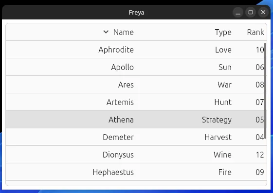
Set of composable components to build Tables.
Table::new()
    .column_widths([Size::flex(4.), Size::flex(3.), Size::flex(1.)])
    .child(
        TableHead::new().child(
            TableRow::new().children(columns.into_iter().map(|(text, order_by)| {
                TableCell::new()
                    .order_direction(if *order.read() == order_by {
                        Some(*order_direction.read())
                    } else {
                        None
                    })
                    .on_press(move |_| on_column_head_click(&order_by))
                    .child(text.to_string())
                    .into()
            })),
        ),
    )
    .child(TableBody::new().child(ScrollView::new().children(
        data.iter().map(|row| {
            TableRow::new()
                .children(row.iter().map(|cell| TableCell::new().child(cell.clone()).into()))
                .into()
        }),
    )))
See component_table.rs for a complete example.
ColorPicker
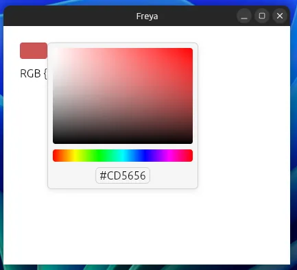
A component to let users select colors.
let mut color = use_state(|| Color::from_rgb(205, 86, 86));

ColorPicker::new(move |c| color.set(c)).value(color())
See component_color_picker.rs for a complete example.
MarkdownViewer
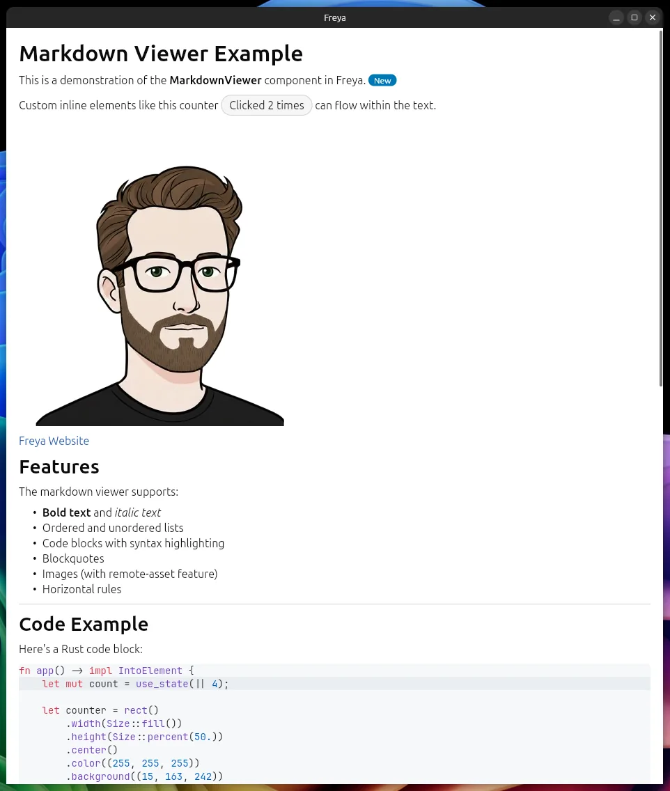
A super simple viewer of markdown content.
MarkdownViewer::new("# Hello\n\nThis is **bold** and *italic*.")Supports headings, lists, tables, code blocks, blockquotes, images, links, and more. See component_markdown.rs for a complete example.
ImageViewer
ImageViewer handles async loading, caching, and error states for local, embedded, and remote images:
ImageViewer::new("https://example.com/photo.jpg")
    .width(Size::percent(50.))
    .a11y_alt("A photo")
    .error_renderer(|err: String| {
        label().color((255, 120, 120)).text(format!("Failed: {err}")).into()
    })
It accepts a URL, a PathBuf, or embedded bytes (("id", include_bytes!("./logo.png"))). See component_image_viewer.rs for a complete example.
Component variants
Most built-in components share a common set of style and layout variant methods, so once you learn them for one component they carry over to the others. For example, Button:
Button::new().child("Default")
Button::new().filled().child("Filled")
Button::new().outline().child("Outline")
Button::new().flat().child("Flat")
Button::new().compact().child("Compact")
Button::new().expanded().child("Expanded")
Button::new().rounded_full().child("Pill")
Button::new().enabled(false).child("Disabled")
And Input exposes the same family of modifiers:
Input::new(text).placeholder("Default")
Input::new(text).placeholder("Filled").filled()
Input::new(text).placeholder("Flat").flat()
Input::new(text).placeholder("Compact").compact()
Input::new(text).placeholder("Expanded").expanded()
Input::new(text).placeholder("Disabled").enabled(false)
Variants compose, so Input::new(text).compact().filled() or Button::new().outline().expanded() work as you would expect. See component_button.rs and component_input.rs for complete examples.
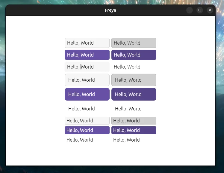
On top of the variants, every themed component now exposes each of its theme fields as a regular builder method. Instead of constructing a ButtonColorsThemePartial and passing it through .theme_colors(...), you can just call the field directly on the component:
Button::new()
    .background((15, 163, 242))
    .hover_background((10, 130, 200))
    .color(Color::WHITE)
    .corner_radius(12.)
    .padding(Gaps::new_all(16.))
    .child("Custom")
These methods are generated from the component’s theme definition, so Input, Switch, Slider, and the rest get the same treatment for their own theme fields. You can still pass a full ThemePartial via .theme_colors(...) / .theme_layout(...) when you want to share an override across many instances, but for one-off tweaks the inline methods are usually enough.
And more
The full list includes: Accordion, Attached, Calendar, Card, Checkbox, Chip, CircularLoader, ColorPicker, ContextMenu, CursorArea, DraggableCanvas, DragZone, DropZone, FloatingTab, GifViewer, ImageViewer, Input, Link, MarkdownViewer, Menu, OverflowedContent, Popup, Portal, ProgressBar, RadioItem, ResizableContainer, ScrollView, SegmentedButton, Select, SelectableText, SideBarItem, Skeleton, Slider, SvgViewer, Switch, Table, Tile, Tooltip, VirtualScrollView.
See more (but not all) in the Components Gallery.
Material Design

The freya-material-design crate adds Material Design flavored extensions on top of the base components, for now only ripple effects. Calling .ripple() on a supported component (Button, Tile, SideBarItem, MenuItem, FloatingTab) will make them show a ripple effect on press.
use freya::material_design::*;

rect()
    .center()
    .spacing(12.)
    // A button with a ripple on press
    .child(Button::new().ripple().child("Click me!"))
    // Any element can ripple by wrapping it
    .child(
        Ripple::new().child(
            rect()
                .width(Size::px(100.))
                .height(Size::px(70.))
                .center()
                .background((70, 40, 120))
                .color(Color::WHITE)
                .child("Click me!"),
        ),
    )
These extensions live behind the material-design feature flag, so you only pull them in when you want them. See feature_material_design.rs for a complete example.
Performance plugin
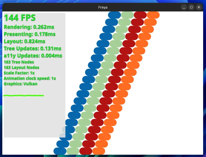
The performance overlay renders a small panel on top of your app with live metrics. The plugin is registered automatically on debug builds, and the overlay starts hidden, show it with Ctrl+Shift+P (or Cmd+Shift+P on macOS):
launch(
    LaunchConfig::new()
        .with_plugin(PerformanceOverlayPlugin::default())
        .with_window(WindowConfig::new(app))
)
See plugin_performance.rs for a complete example.
For deeper profiling there is also a hotpath feature that integrates the hotpath profiler with Freya’s internals, see integration_hotpath.rs.
Example values of plugin_performance.rs example in a debug build in my PC:
Hot reload (experimental)
Freya 0.4 supports hot reloading, powered by subsecond and driven by the dx CLI from Dioxus. While your app is running, saved changes are compiled into a patch and pushed into the live process, no rebuild and restart needed.
It is gated behind the hotreload feature flag, and just like devtools, the recommended setup is to forward it from a feature in your own crate:
# In your Cargo.toml
[features]
hotreload = ["freya/hotreload"]
Install Dioxus CLI:
cargo install dioxus-cli

dx serve --hot-patch --features hotreload
Keep in mind that hook state is reset and spawned tasks are cancelled on every patch, and that only function bodies can be patched, structural changes like new types or changed signatures still require a restart. See the Hot Reload docs for the details.
Devtools
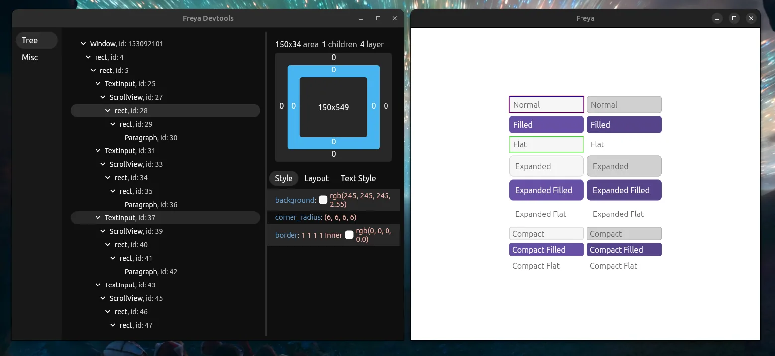
Freya ships with a devtools application that connects to your running app to inspect and debug it in real time. With it you can browse the node tree, inspect element styles, layout, and text styles, highlight elements on hover, and control the animation speed.
The devtools server is gated behind the devtools feature flag, and the recommended setup is to forward it from a feature in your own crate so it never leaks into release builds:
# In your Cargo.toml
[features]
devtools = ["freya/devtools"]
No code changes are needed: when the feature is active, launch automatically registers the devtools server plugin. The UI itself is a separate standalone app, freya-devtools-app, which you install once and run alongside your app:
cargo install freya-devtools-app

# then, with your app running with `--features devtools`:
freya-devtools-app
It connects automatically, retrying until your app is up. Only one devtools-enabled app can run at a time, since the server listens on a fixed local port.
Accessibility
Freya has built-in accessibility support with focus management and ARIA-like roles:
let a11y_id = use_a11y();
let focus = use_focus(a11y_id);

rect()
    .a11y_id(a11y_id)
    .a11y_role(AccessibilityRole::Button)
    .a11y_auto_focus(true)
    .background(if focus.read().is_focused() {
        (100, 149, 237)
    } else {
        (200, 200, 200)
    })
    .on_press(move |_| {
        a11y_id.request_focus();
    })
The Platform API exposes the current navigation mode so you can style focus rings differently for keyboard vs pointer navigation:
let platform = Platform::get();
let keyboard_nav = *platform.navigation_mode.read() == NavigationMode::Keyboard;
When navigating with the keyboard, ScrollViews automatically scroll the focused element into view. See feature_scroll_to_focus.rs and feature_controlled_focus.rs for keyboard navigation and programmatic focus control.
There is also an optional zoom-shortcuts feature that adds browser-style zooming of the whole window with Ctrl/Cmd and +, - or 0.
See feature_a11y_grouping.rs for a complete example.
Rendering
These are the current backends preferences in the different supported platforms.
- Windows: OpenGL -> Software
- Linux: Vulkan -> OpenGL -> Software
- macOS: Metal -> Software
- Android: OpenGL -> Software
Android support (experimental)
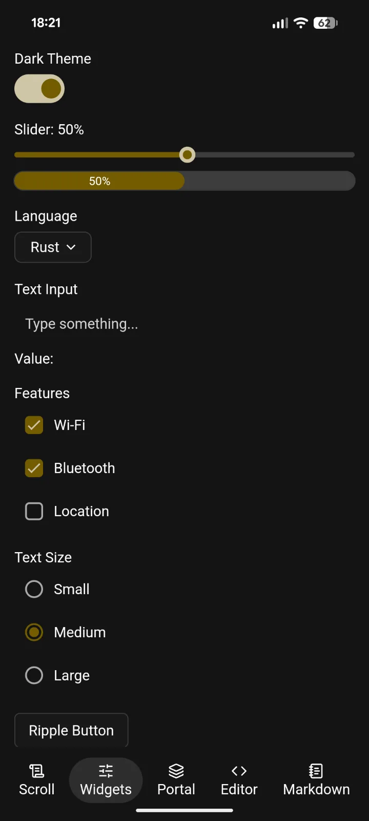
Freya 0.4 has experimental Android support via the new freya-android crate.
See the ./examples/android example for the code:
Custom renderer backends
Freya is not tied to winit or to having a window at all. The core exposes integration APIs that let you run apps on your own backend, where you feed it events and it gives you back a rendered frame. This makes it possible to embed Freya in other apps, headless setups, other windowing managers, or even Rust compositors. These integrations are not always straightforward, but Freya gives you the tools and APIs to make them possible.
If you want to build a custom renderer, checking the code of freya-testing and freya-winit is recommended, as they are both renderers themselves.
See feature_embedded.rs for a minimal example that runs an app without a window and rasterizes frames to images.
Freya SDK
The freya-sdk crate is a small collection of higher-level utilities built on top of the core hooks, for things that are common but not worth pulling into the framework itself. Right now it ships use_timeout (a resettable timer you can use to render UI only until some duration has elapsed) and, with the tokio feature, use_track_watcher to subscribe a component to a Tokio watch channel. It lives behind the sdk feature flag and is meant to grow with more of these helpers over time.
Feature flags
Freya uses feature flags to keep the default build lean. Enable only what you need:
routerfor client-side routingi18nfor internationalizationradiofor channel-based global stateiconsfor the Lucide icon librarywebviewfor embedded web viewsterminalfor terminal emulationcode-editorfor syntax-highlighted editorcamerafor camera capturevideofor video playbackplotfor charting with Plotterstrayfor system tray supporttitlebarfor custom window titlebarsmaterial-designfor Material Design components and ripple effectscalendarfor date pickermarkdownfor markdown renderinggiffor animated GIFsqueryfor the query/caching systemsdkfor the Freya SDK utilitiesremote-assetfor loading assets from URLsdevtoolsfor the development inspectorperformancefor the performance overlayhotreloadfor hot reloading through thedxCLIhotpathfor the hotpath profiler integrationzoom-shortcutsfor browser-style window zoom shortcutsmarkdown-code-editorfor syntax-highlighted code blocks inMarkdownViewerengineto re-export the underlying Skia APIs
Personal apps
I have been working on some apps that use Freya:
valin
Dogfooding code editor built on top of the freya-code-editor and other APIs like docking.
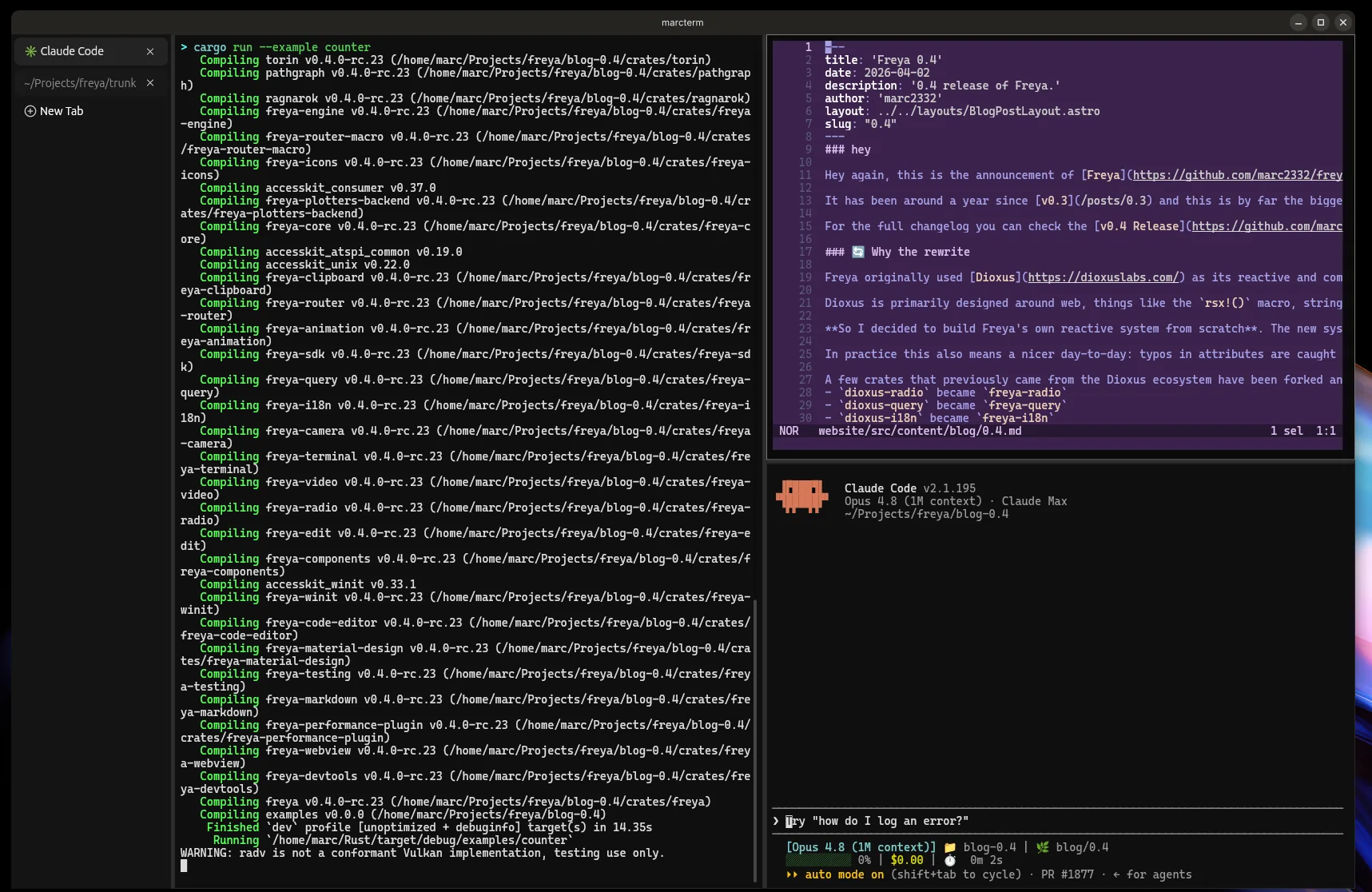
marcterm
Terminal emulator powered by freya-terminal. I use this daily btw :)
Sanctum
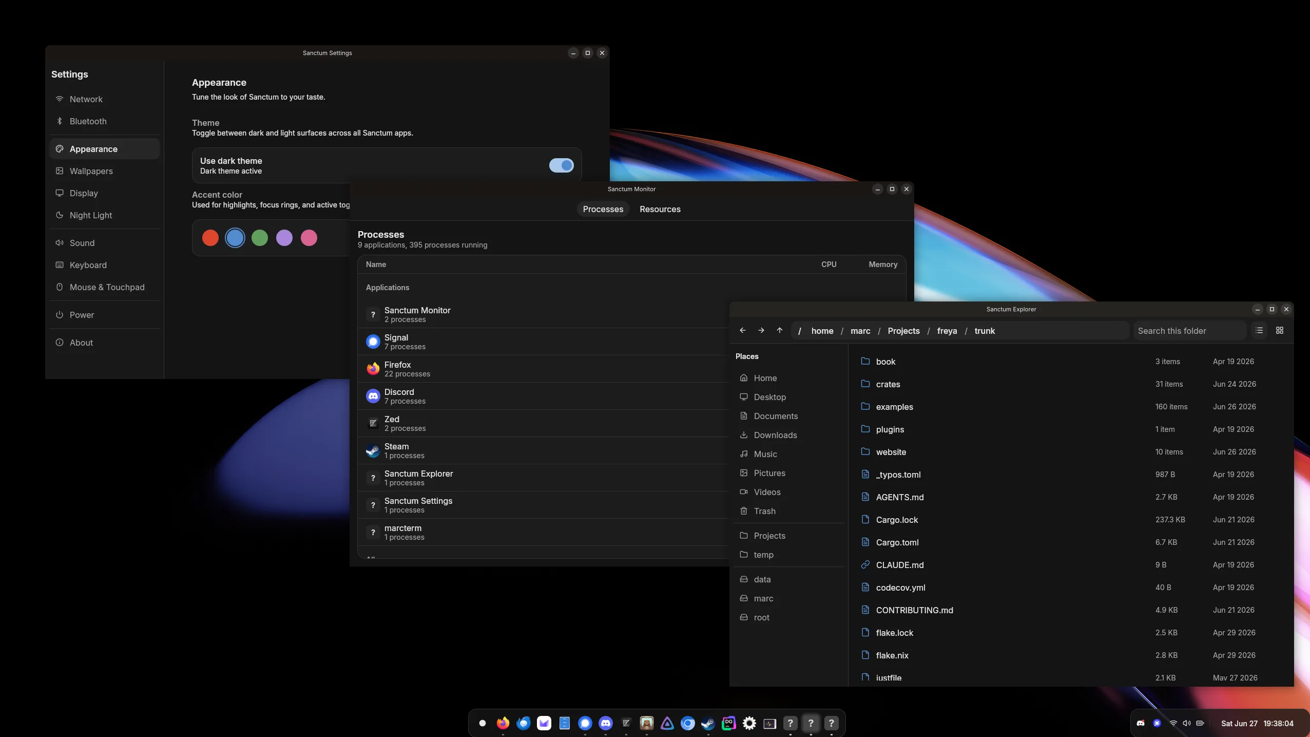
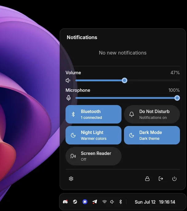
Sanctum is my own (but heavily assisted with AI) Linux Desktop Environment. It consists of a compositor using smithay, shell (dock, control panel, etc) and apps (settings app, file explorer and process monitor).
I have been using it for weeks on my PC.
Thanks
Thank you to everyone who contributed to this release, whether through code, bug reports, or feedback. Special thanks to SparkyTD for the Android support work. And also to Paweł for making performance debugging easier with hotpath profiler.
Thanks as well to my sponsors piny4man, 高庆丰, Mark, Huddy Buddy and Gabriel Jõe. And to previous sponsors since last release: Lino Le Van.
If you want to support Freya’s development, you can sponsor me on GitHub.